The Monochrome Pop-Up Strategy: The Power of "Color Drenching" in Retail
While we strive to credit all original designers, some archival images remain uncredited. Please contact us for proper attribution.
Additionally, this post may contain affiliate links to our recommended materials, meaning the studio may earn a small commission at no extra cost to you.
In the crowded landscape of experiential retail, brands are constantly fighting for pedestrian attention. While many rely on maximalist patterns or chaotic digital screens to stand out, a radically different—and arguably more powerful—strategy is emerging among top-tier brands: the unapologetic domination of a single hue.
By erasing visual clutter and wrapping an entire temporary space in one solid tone—a technique known as "Color Drenching"—brands cut through the noise and achieve highly specific strategic goals. Here is a breakdown of 4 ways luxury and lifestyle brands use the monochrome pop-up, and how you can apply this high-impact rule to your own events.
01. THE HERITAGE ANCHOR: Color as Brand DNA
The Pop up Store Strategy: Instant Recognition.
For brands with a historically powerful visual identity, the monochrome pop-up is the ultimate flex of authority.
The Execution: Think of Tiffany & Co.’s iconic robin's-egg blue, or the famous Hermèsmatic pop-ups completely drenched in the House's signature vibrant orange (from the washing machines to the walls).
The Goal: The color itself becomes the logo. For the pedestrian, the brand recognition is immediate, wordless, and absolute.
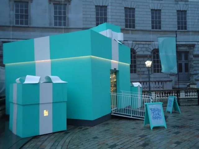
Tiffany pop up store, London
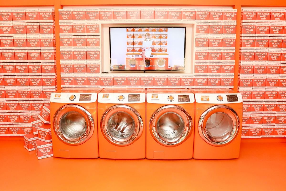
Hermèsmatic pop up store
02. THE PRODUCT CATALYST: Color as Inventory
The Pop Up Strategy: The Immersive Campaign.
Here, the color isn't necessarily the brand's logo; it is dictated entirely by a specific product launch.
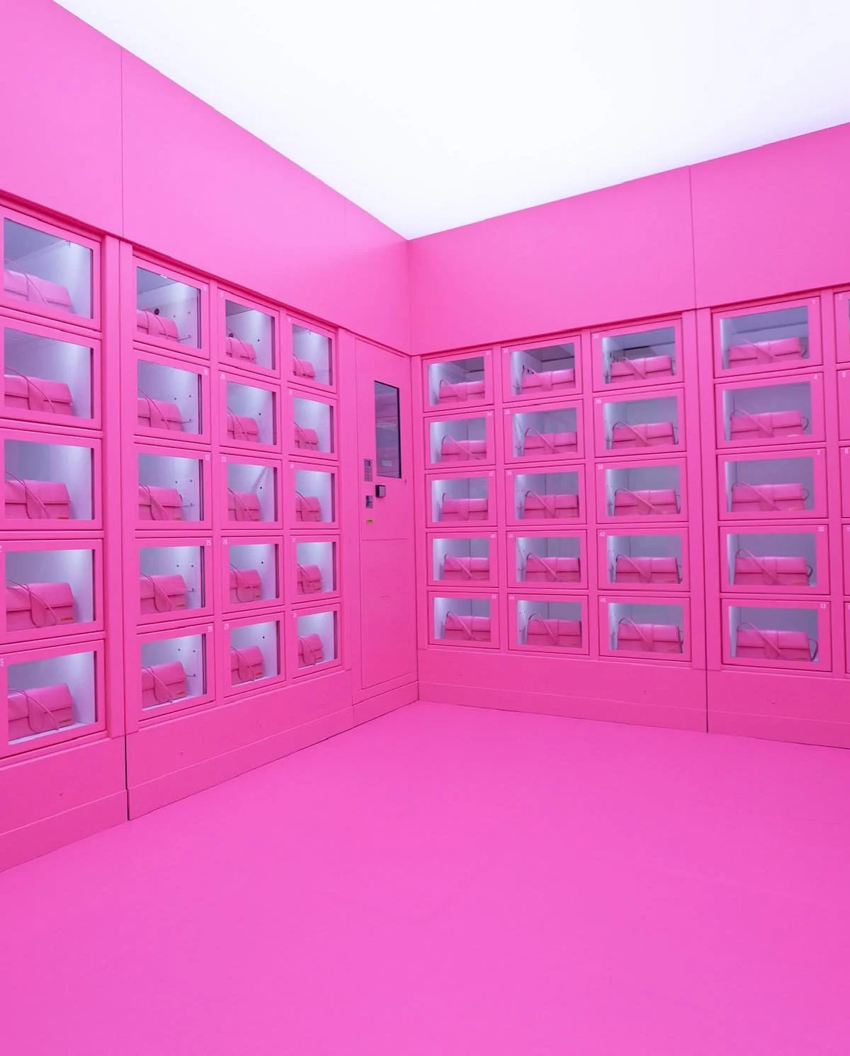
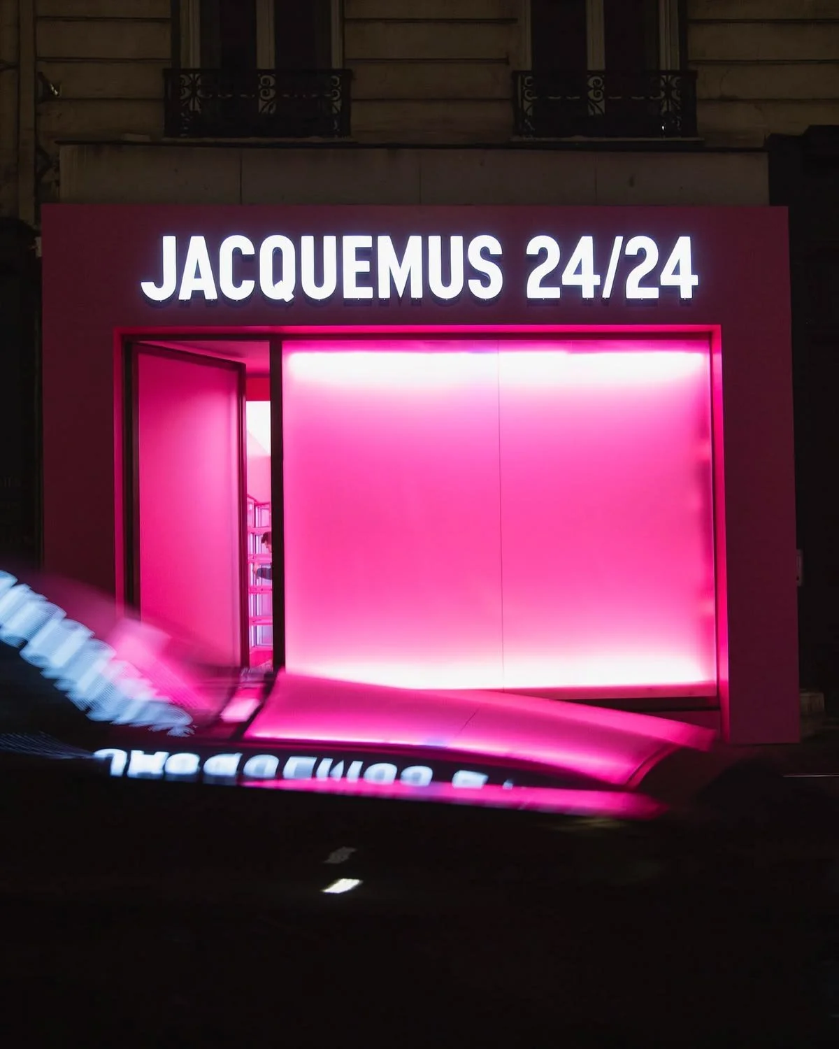
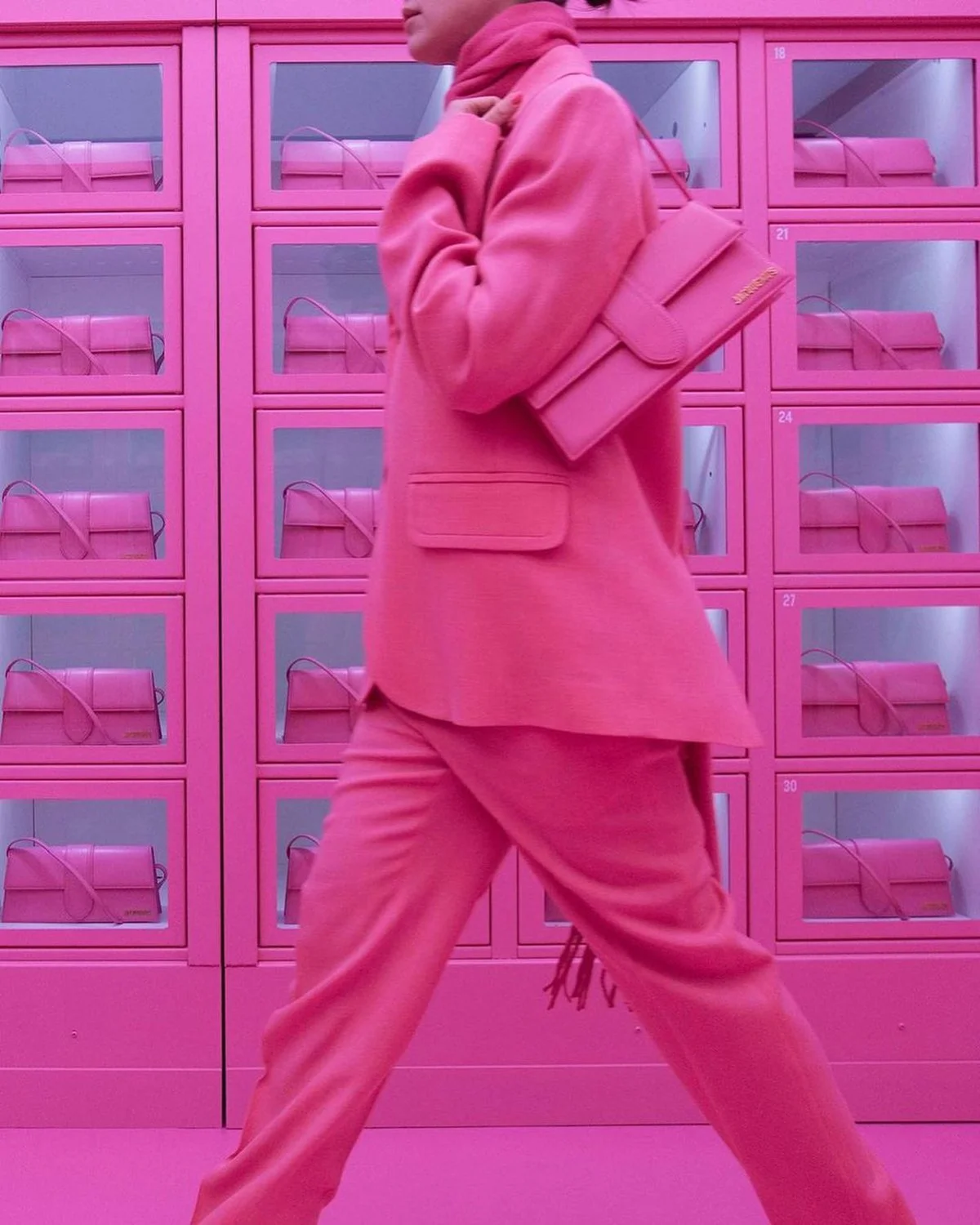
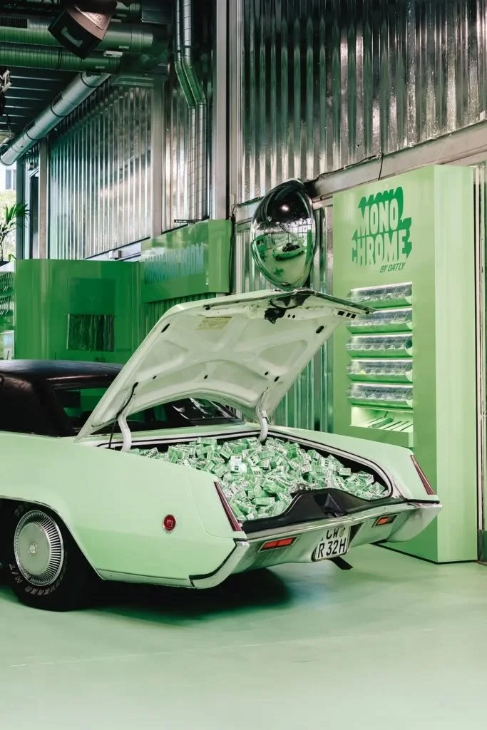
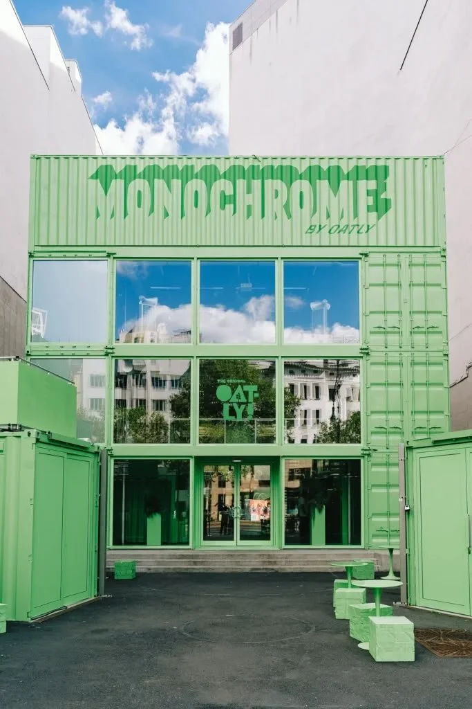
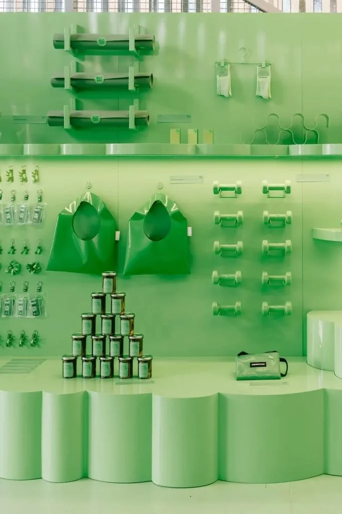
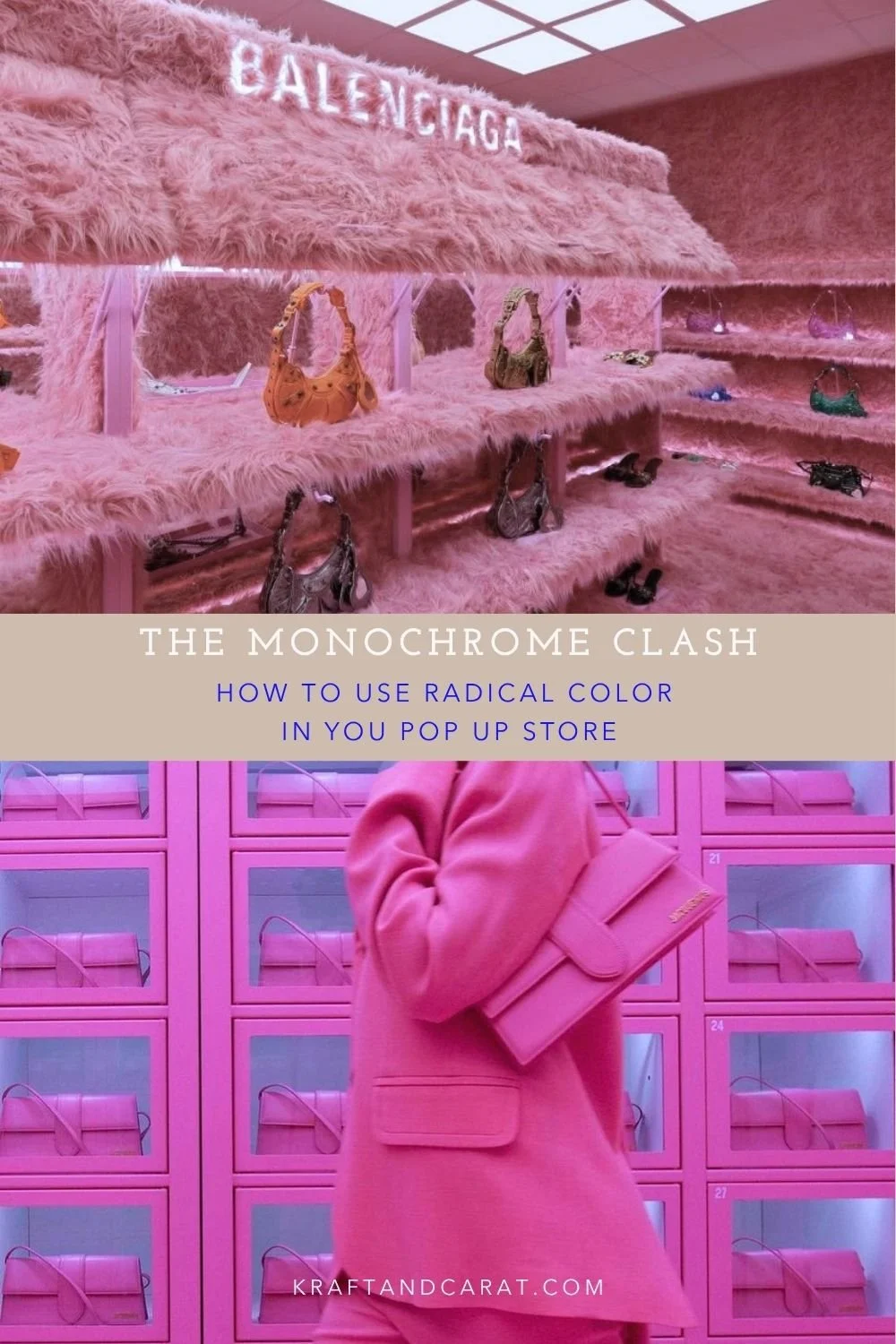
The Execution: When Jacquemus launched an all-pink capsule collection, the entire pop-up boutique—down to the shelves and the coffee cups—was painted in the exact same pink. More recently, in late summer 2026, Oatly launched a brilliant "Monochrome" container pop-up in Berlin covered entirely in matcha green to launch their new matcha drink (capitalizing on that highly "Instagrammable" pistachio/matcha color trend we also saw at Loewe here).
The Goal: It creates a "mise en abyme". The product doesn't just sit in the space; it is the space. It forces the customer to focus on one specific collection without any visual distraction.
03. THE CLASH: Color and Textural Disruption
The Pop Up Strategy: Viral Shock Value.
What if you want your product to violently contrast with the environment? You use monochrome combined with extreme, unexpected textures.
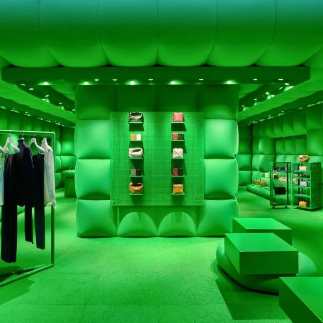
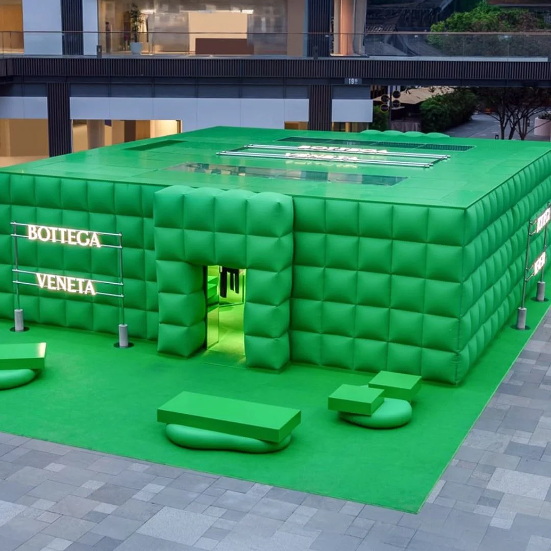
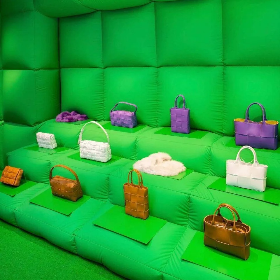
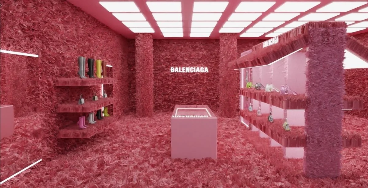
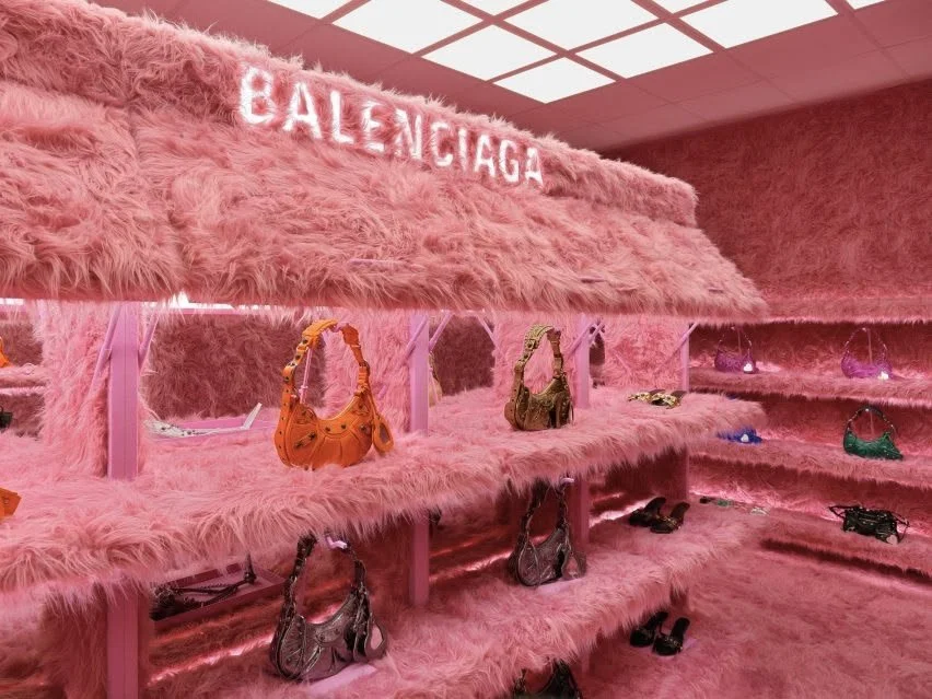
The Execution: Balenciaga’s famous Le Cagole pop-up was entirely covered in fluffy, bright pink faux fur. Similarly, Bottega Veneta has deployed massive, grass-green inflatable storefronts.
The Goal: Pure visual disruption. The aggressive color and bizarre textures (fur, inflatables) create a highly viral, surrealist backdrop. Because the background is so extreme, the actual products (a sleek leather bag or a sharp shoe) clash against it, making them pop out in brilliant 3D relief.
04. THE "SENSORY SANCTUARY": Color as Emotion
The Pop Up Strategy: Physiological impact and dwell time.
Color doesn't just catch the eye; it physically alters the customer's emotional and physiological state. By wrapping a space in a single, deeply intentional hue, brands can create a sensory sanctuary that forces the customer to slow down, drastically increasing their "dwell time."
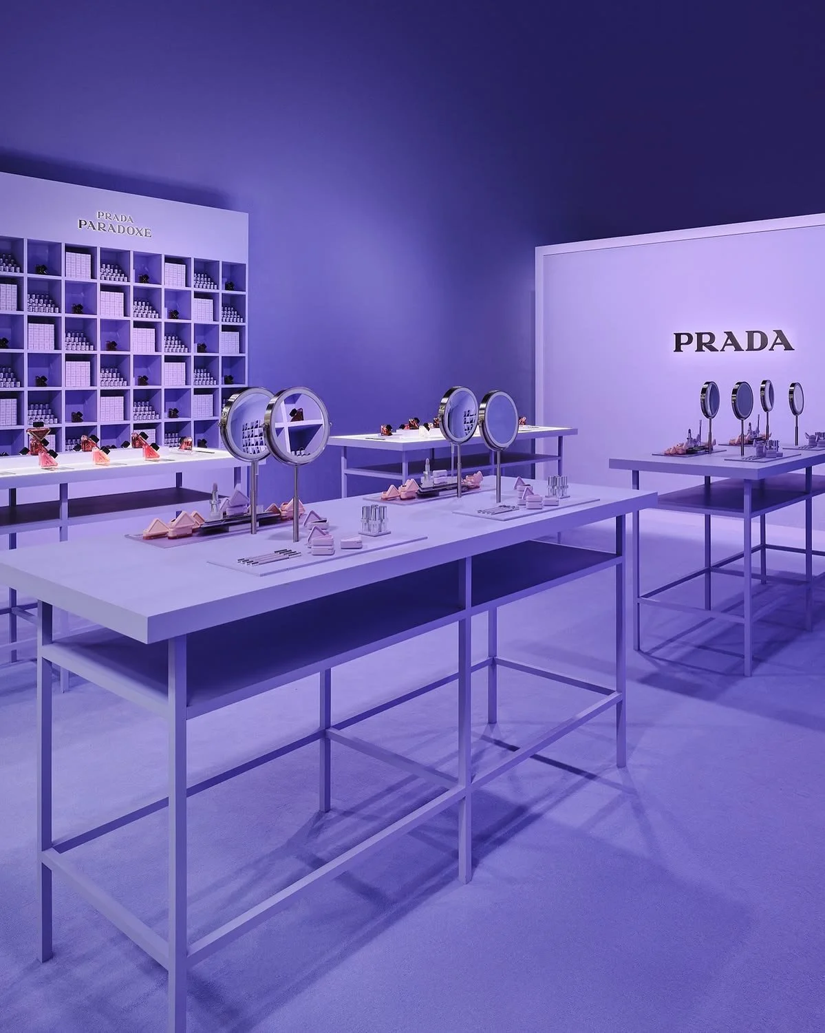
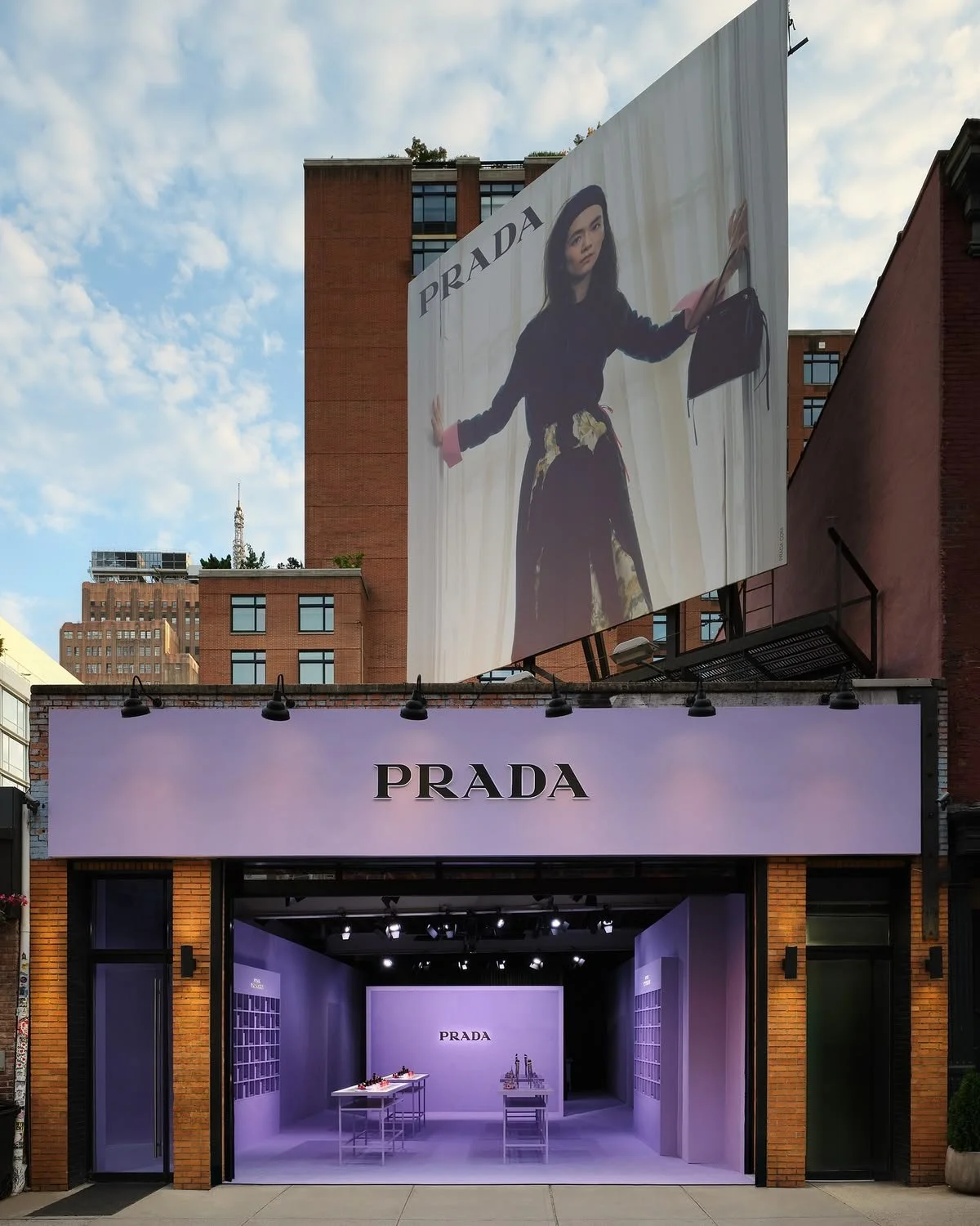
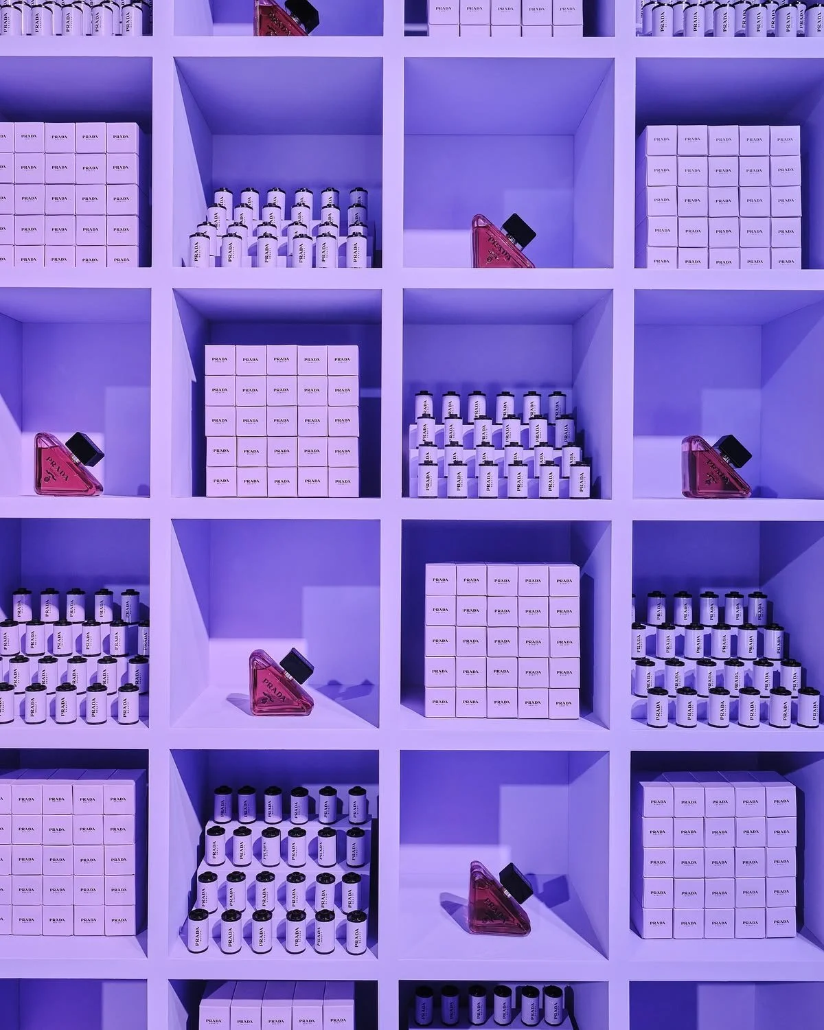
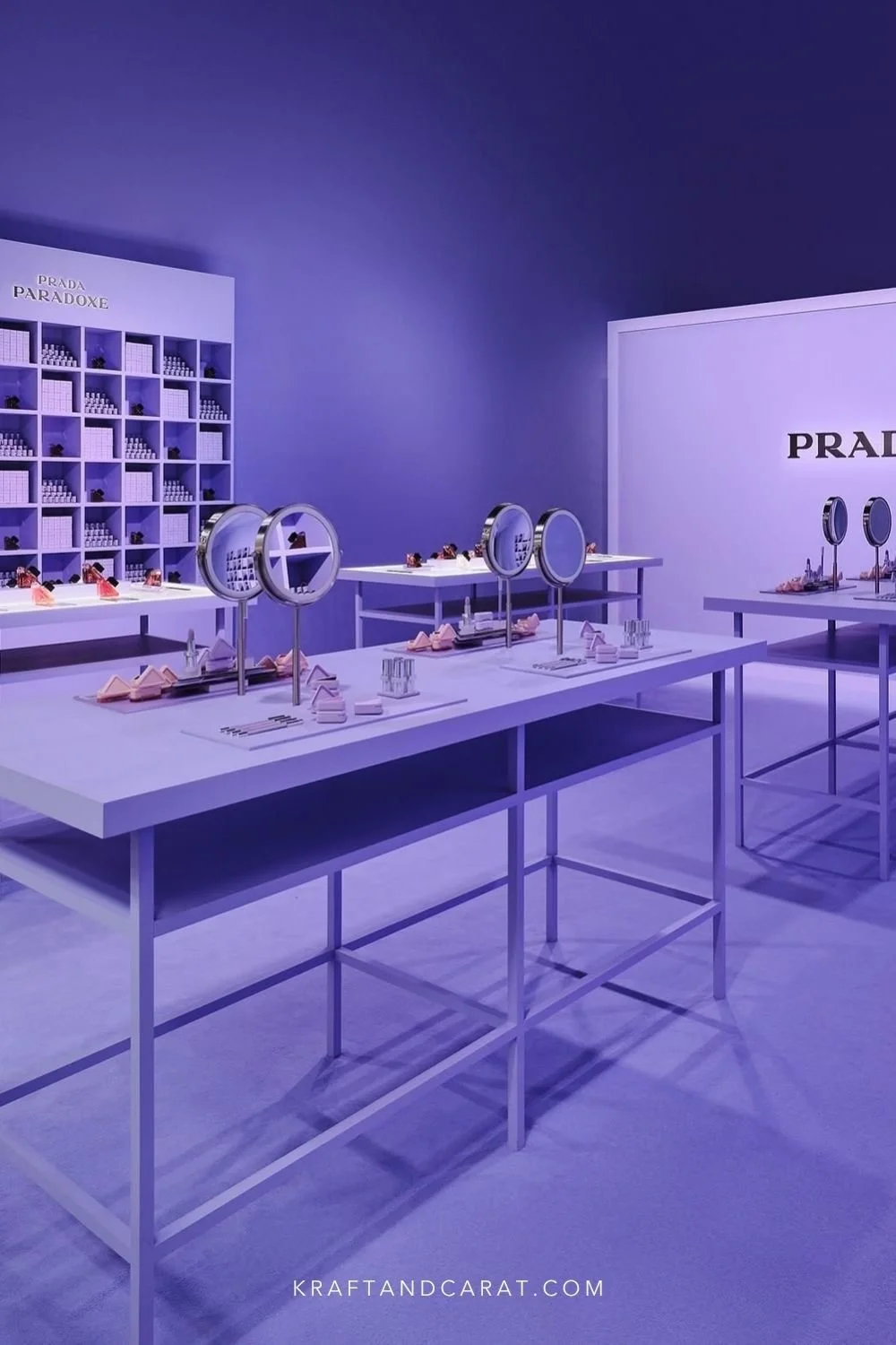
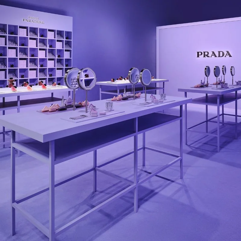
The Calming Effect (Prada's "Sweet Chemistry"): For their Soho pop-up, Prada utilized a clinical yet soothing pastel lavender. In a chaotic, over-stimulating urban environment like New York, stepping into a perfectly monochromatic, soft-lilac space physically lowers the heart rate. It acts as a visual detox, transforming the boutique into a futuristic, calming bubble.
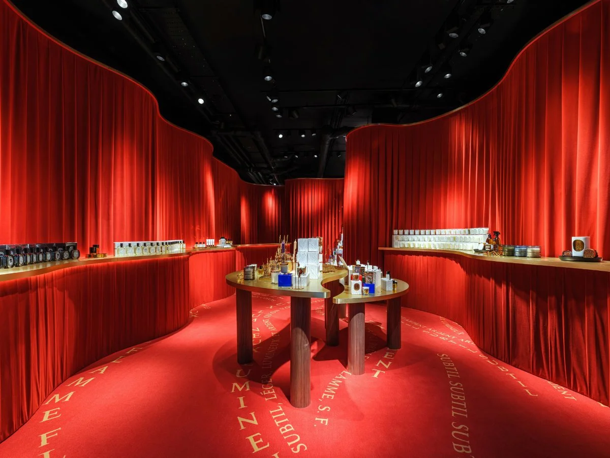
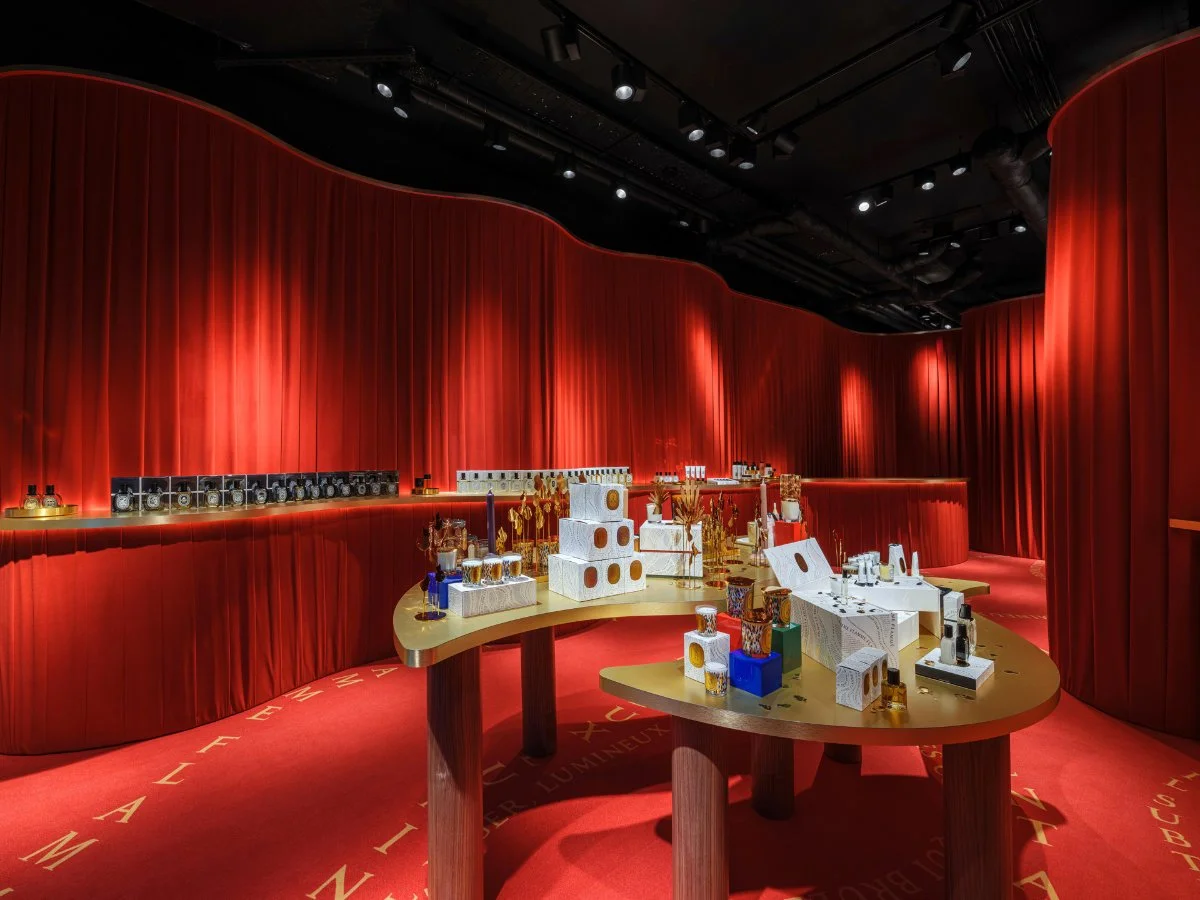
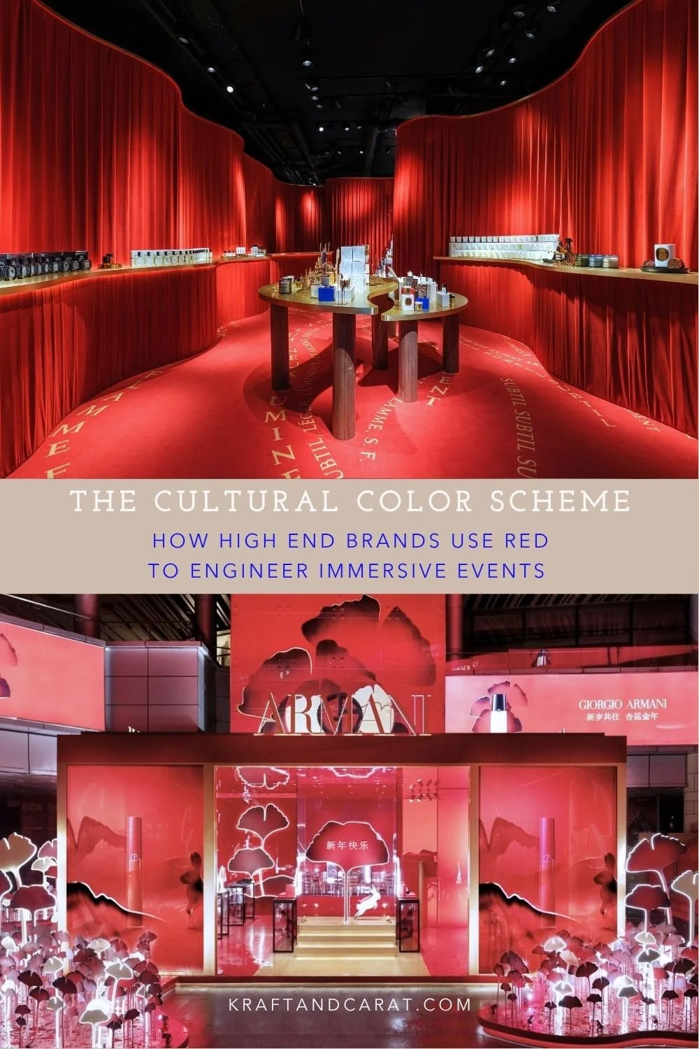
The Hypnotic Warmth (Diptyque’s "Dancing Flame"): Conversely, Diptyque took over London with a deep, monochromatic crimson red for Christmas. Instead of clinical detachment, the dark red created an enveloping, womb-like intimacy. The heavy, warm color absorbed the outside noise and created a hypnotic atmosphere, making the retail space feel like a private, exclusive club.
✧ The Studio Secret (Material Matters): Notice how Diptyque didn't just paint the walls red; they draped the space in heavy crimson velvet. Fabric doesn't just hold color beautifully—it acts as an acoustic dampener, which is crucial for muffling street noise and creating that silent, womb-like sanctuary (see our fabric hack article here)
05. THE CULTURAL CODE: Color as Global Localization
The Pop Up Strategy: Seasonal alignment and demographic targeting.
The most strategic use of the monochrome trend happens when a brand temporarily abandons its own visual DNA to adopt the cultural codes of its target market.
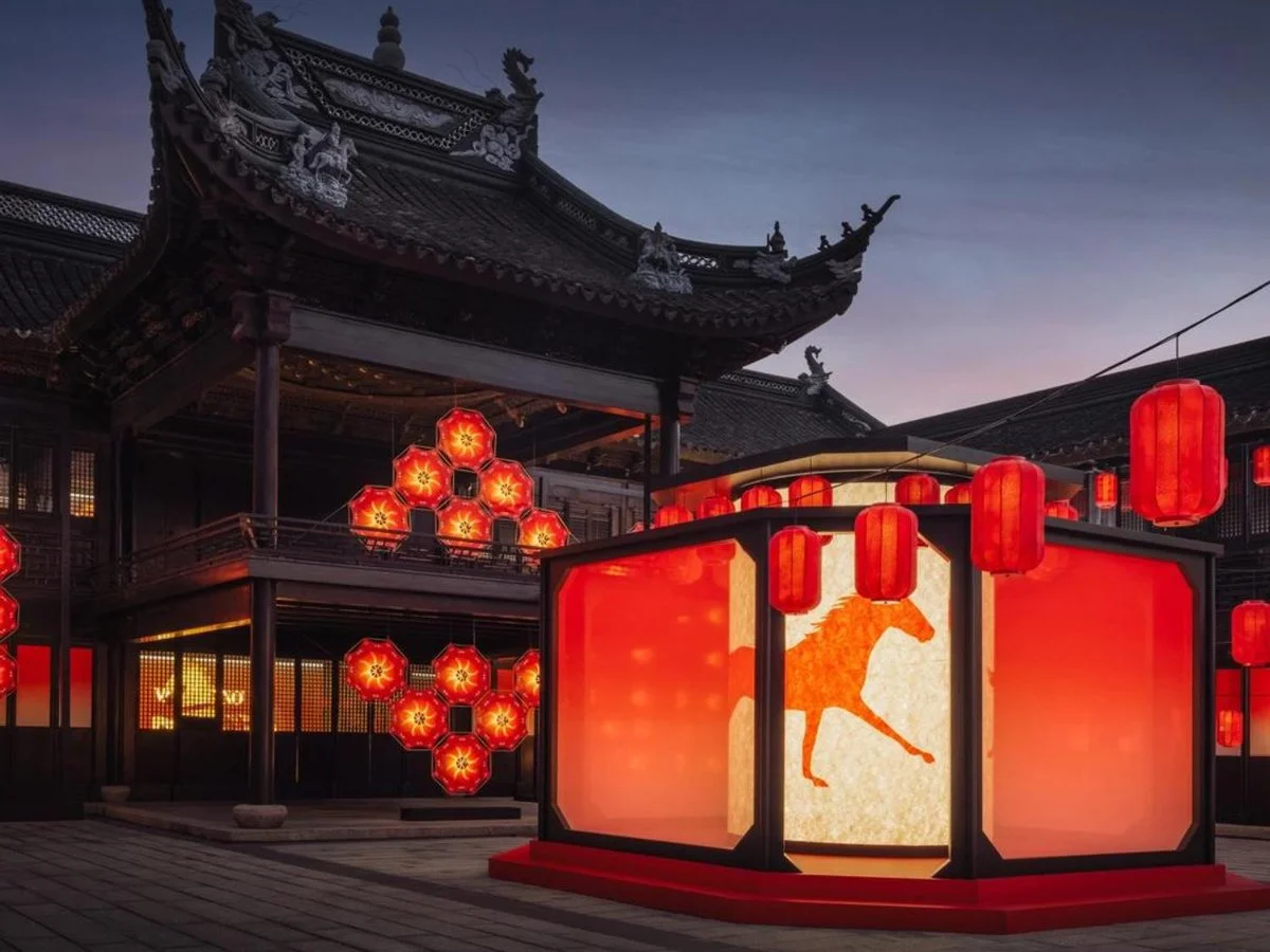
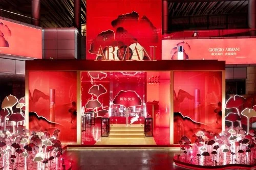
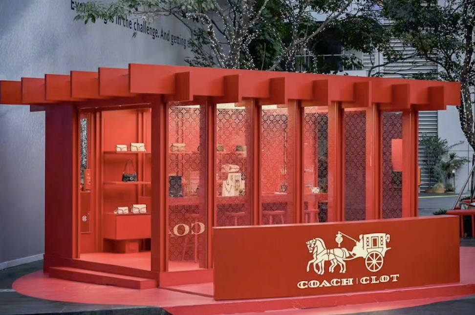
The Lunar New Year Takeovers: If you observe luxury retail in Asia (or global flagships catering to the Asian market) during the Lunar New Year, the shift is absolute. Brands completely drench their pop-ups, storefronts, and visual merchandising in monochromatic Red.
The Takeaway: This isn't just an aesthetic choice; it is a profound marketing localization strategy. By adopting the cultural color of luck, joy, and prosperity, luxury houses signal deep respect and alignment with the local demographic's most important retail season. It proves that color is a universal language used to build immediate cultural bridges.
The "Kraft" Approach: How to Steal the Monochrome Hack
You don’t need a Prada or Balenciaga budget to create an immersive brand activation. In fact, "Color Drenching" is the ultimate budget-friendly hack for independent brands.
If you are renting a temporary, blank-canvas space, don't waste money sourcing dozens of different, expensive props. Pick one bold color. Paint cheap wooden risers in that exact color. Buy vinyl flooring in that color. Dress your staff in that color.
By eliminating visual noise and committing to a 100% monochromatic scheme, everyday inexpensive materials instantly read as high-end, bespoke art installations.
READY TO DESIGN YOUR OWN IMMERSIVE POP UP?
Color drenching might stop foot traffic, but a flawless spatial flow is what actually converts visitors into buyers. A bold color scheme cannot fix a poorly planned space. Before you buy a single bucket of paint, ensure your event foundations meet luxury standards.

Pin for inspiration, or share these retail strategies with your network.