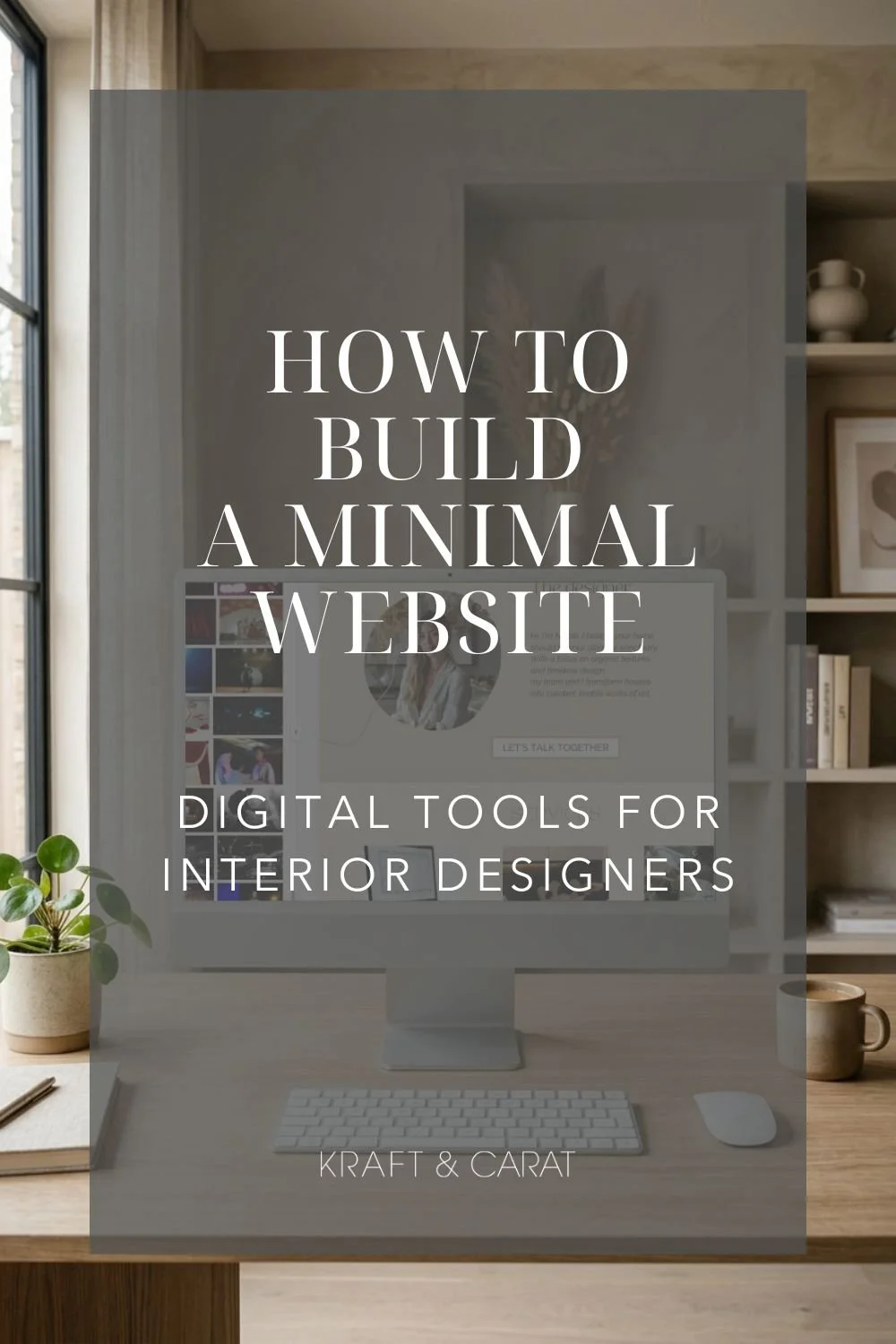
Why Interior Designers Need a One-Page Website (And What to Include)
Each selection is carefully curated with an independent eye, guided by a desire to highlight thoughtful, timeless and inspiring pieces.
Curator's Note: As a Paris-based studio, most edits highlight some of my favorite European-accessible design houses...

If you are an interior designer, a virtual decorator, or a home stager, your online presence is your ultimate business card. Yet, I see incredibly talented designers making the same mistake every day: driving their Instagram traffic to a confusing, generic "Link in Bio" page full of random buttons.
When a potential client clicks the link in your bio, they are looking for reassurance. They want to know your style, your prices, and how to hire you. Sending them to a messy menu creates friction, and in the digital world, friction kills bookings.
The solution? The One-Page Website.
Also known as a Landing Page or a Webpage, a one-page site is a single, beautifully curated scrolling experience. It combines the editorial elegance of a high-end website with the laser-focused efficiency of a sales funnel.
As a scenographer and digital curator, here is my blueprint for creating a high-converting one-page portfolio that turns casual followers into paying clients.
1. THE HERO SECTION (The First Impression)
You have 3 seconds to capture their attention. Do not waste the top of your page with a wall of text. Use a stunning, full-bleed image of your best project. Overlay it with a clear, powerful headline that states exactly who you are and who you serve (e.g., "Elevated E-Design for the Modern Minimalist"). Follow this immediately with a primary "Book a Call" button.
2. THE SERVICE BREAKDOWN
Clients are often confused about how interior design services actually work. Dedicate a clean, structured section to your packages. Keep it to your top 2 or 3 offerings (like Full-Service Design, Virtual E-Design, and Design Consultation). Give a brief description and a starting price to pre-qualify your leads and filter out clients who don't have the budget.
3. THE CURATED PORTFOLIO
This is your digital gallery. Avoid dumping 50 photos into a grid. Act as a curator: select your top 6 images that represent the exact style you want to be hired for. Mix wide room shots with macro-details (a beautiful fabric texture or a styled coffee table) to create an editorial, magazine-like feel.
4. THE PROCESS ROADMAP
Anxiety is the biggest hurdle for new clients. They don't know what happens after they pay you. Eliminate this fear by outlining a simple, 3-step process. (e.g., 1. The Discovery Call / 2. The Concept Phase / 3. The Final Reveal). This shows you are a professional with a proven system.
5. THE FRICTIONLESS CONTACT FORM
Never end your page with just an email address. The bottom of your one-page site should feature a strong Call-To-Action (CTA) linking directly to your client intake form (like HoneyBook or a Google Form) or your Calendly link. When they reach the bottom of the page, they should be ready to book.
The Secret Hack: You Don't Need to Code
The biggest barrier to getting a professional website is usually the cost and the tech headache. But in 2026, you do not need to spend $3,000 on a web developer or pay expensive monthly hosting fees.
You can build your entire One-Page Website in Canva.
Canva now allows you to design a fully responsive website and publish it for free, directly from their platform.
To help you skip the blank page phase and launch your site today, I have translated my agency-level workflow into a ready-to-use template.
✎ Discover the Kraft & Carat Interior Design Webpage Template Here
Designed with an "Organic Modern" aesthetic, this Canva template includes all the strategic sections mentioned above, complete with pre-set subtle scroll animations. Just drop in your portfolio photos, add your booking link, and hit publish.
Stop using a basic link tree. Give your design business the luxurious digital stage it deserves.


Want to create your webpage? Hover over your favorite image above to pin it...