
The H&M Home x Kelly Wearstler Collaboration, A Masterclass in Scenography
Each selection is carefully curated with an independent eye, guided by a desire to highlight thoughtful, timeless and inspiring pieces.
Curator's Note: As a Paris-based studio, most edits highlight some of my favorite European-accessible design houses...
In 2004, H&M shocked the fashion world by launching a mass-market collaboration with Karl Lagerfeld. It bridged the untouchable realm of haute couture with the high street, changing retail forever. Fast forward to today, and H&M Home is pulling off the exact same cultural coup in the interior design space.
Set to launch this September, H&M Home has partnered with none other than Kelly Wearstler for their first-ever global designer collaboration.
If you are unfamiliar, Wearstler is the undisputed "Pope" of high-end, maximalist American design. The LA-based creative visionary is the mastermind behind the iconic Viceroy and Proper Hotels, as well as private sanctuaries for A-listers like Cameron Diaz. Her aesthetic is bold, deeply textural, and unapologetically luxurious.
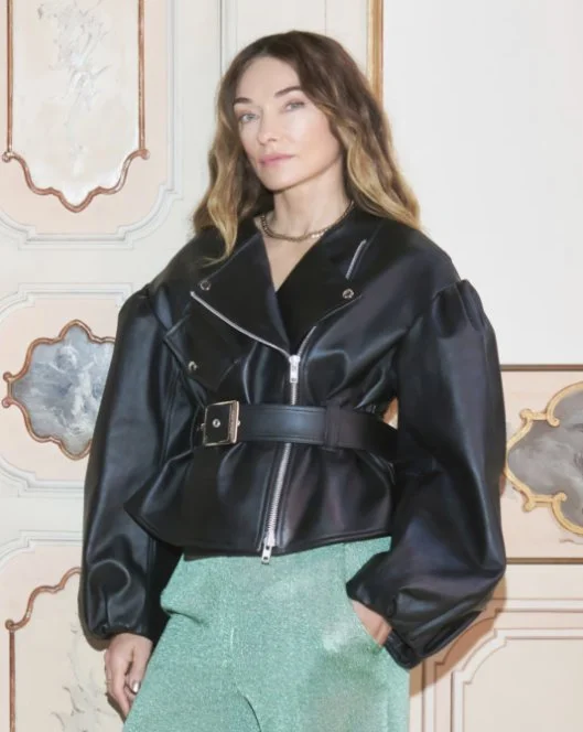
“Through its mixed materiality and emphasis on craftsmanship. There is an element of surprise and uniqueness in every piece.”
Translating that bespoke, elite design language into a mass-produced, accessible collection is both a logistical and creative challenge. But based on their exclusive preview at Milan Design Week (a debut appearance for both brands), the result is nothing short of spectacular.
As a scenographer, what struck me wasn't just the products themselves, but the immersive universe they built to present them.
The Tension of Eras: Inside a secret palazzo
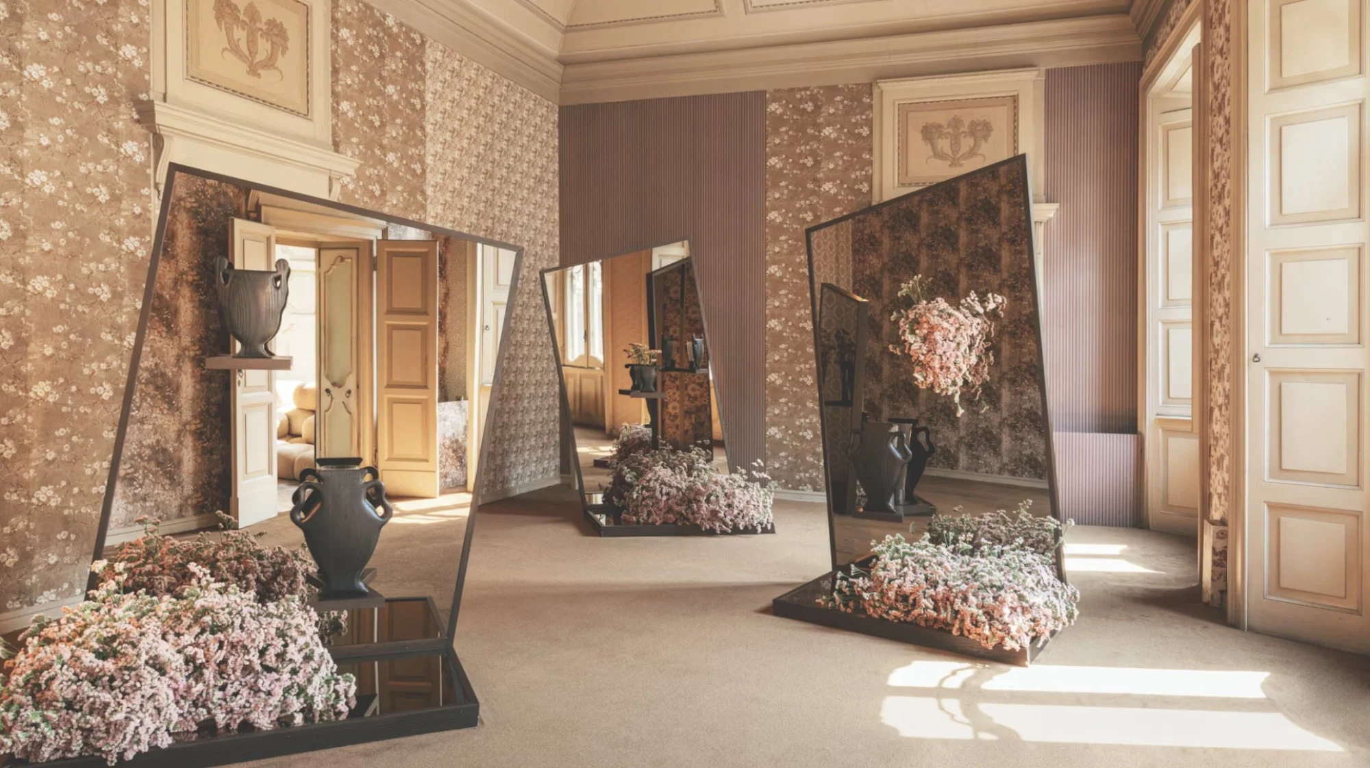
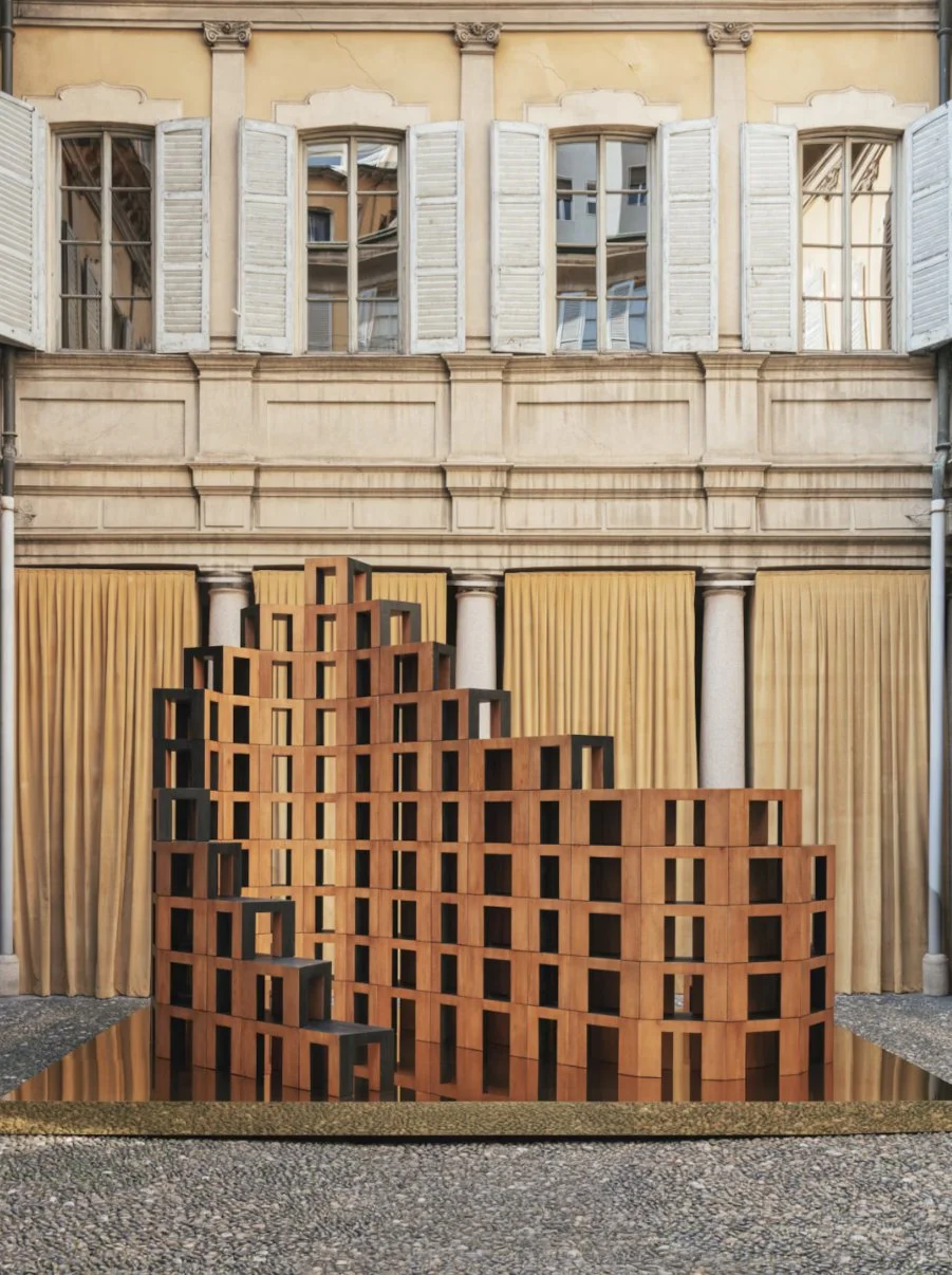
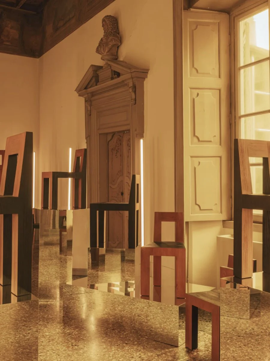
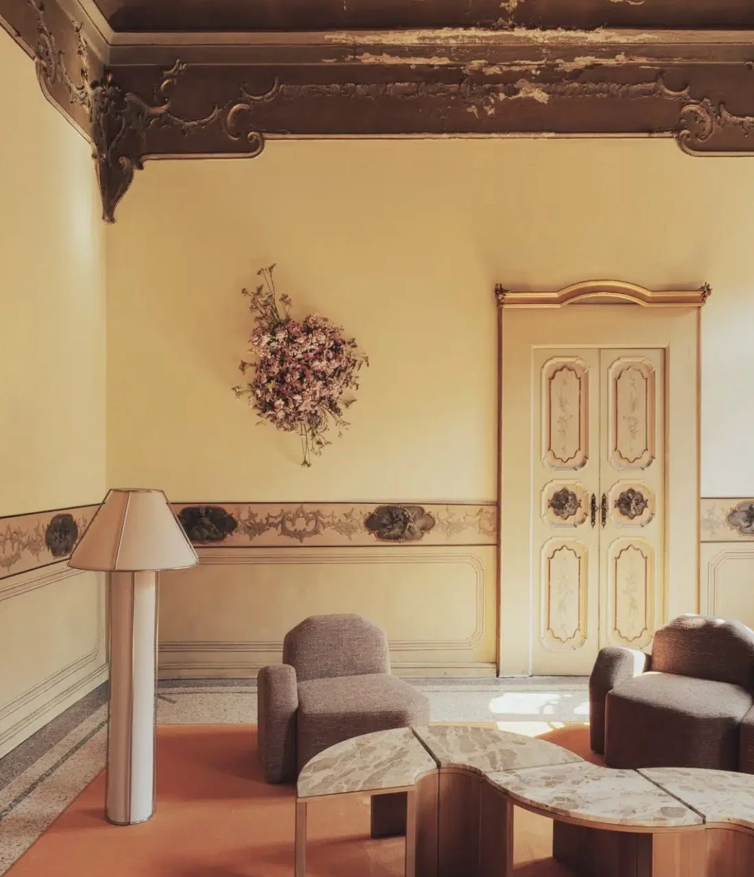
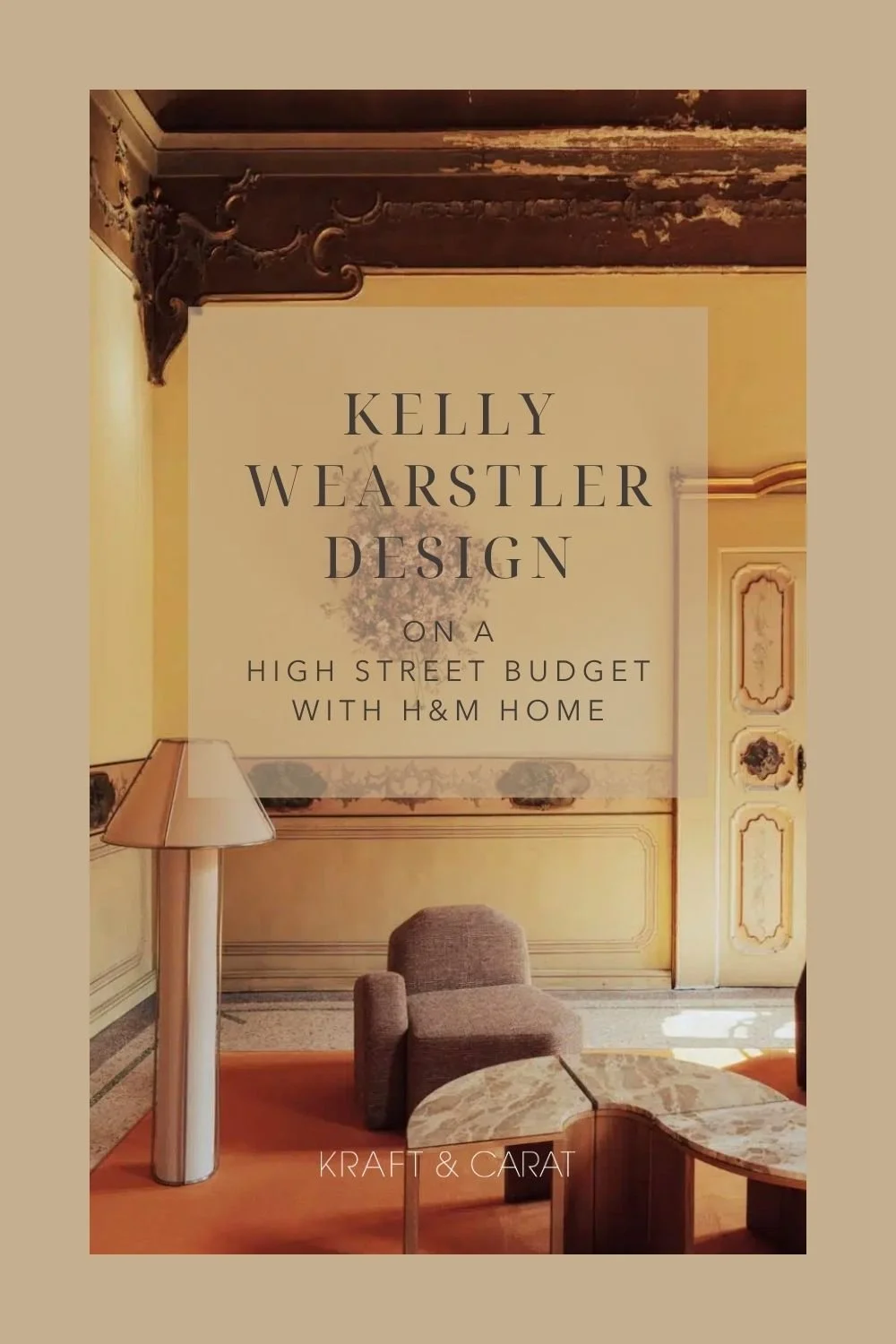
To debut the collection, the brands took over the barocco 17th-century Palazzo Acerbi in Milan. This was a stroke of scenographic genius. Placing Wearstler’s hyper-modern, edgy, and sometimes brutalist pieces against ornate frescoes and historic Italian architecture created an electric visual tension. It proved that modern design needs historical context to truly shine, making it timeless, because “designing item with the idea that objects can live beyond the moment adds a deeper sense of meaning”, says Kelly.
Scenography Breakdown: A Sensory Journey
The exhibition wasn't a mere showroom; it was a carefully curated spatial narrative, designed by Studio Boum. Here is how they elevated the collection through scenography, each room evoking an everyday gesture: dining room, music room…
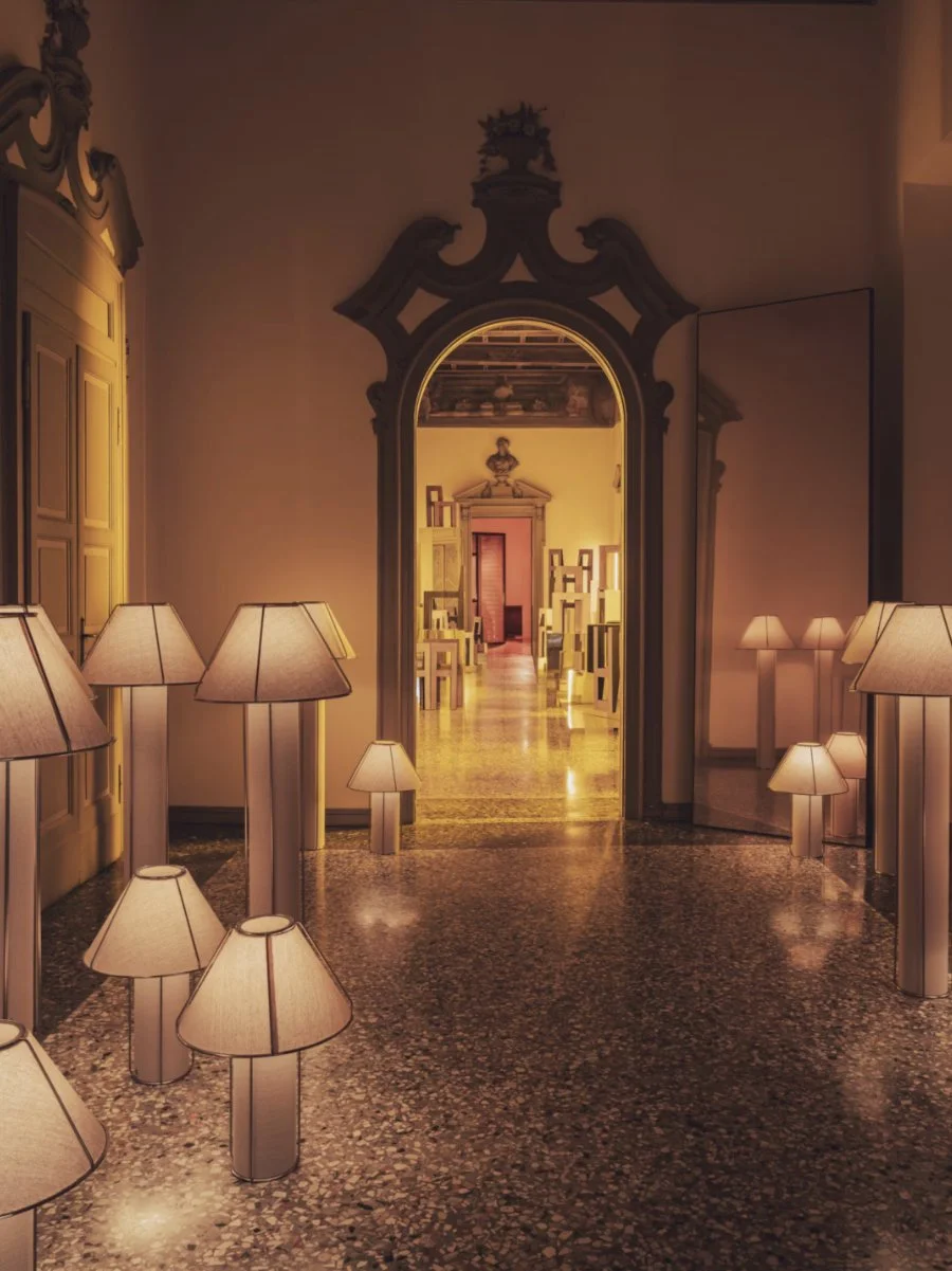
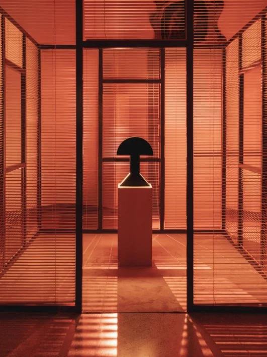
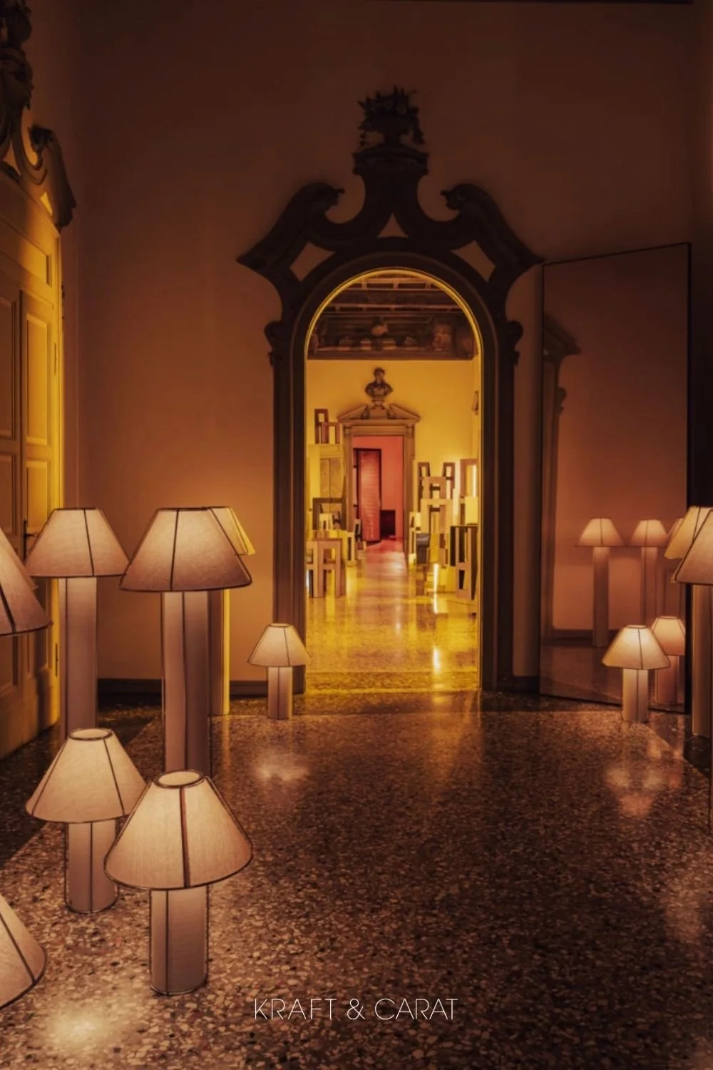
The Antechamber (Mastering Shadows):
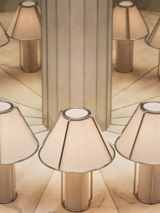
Instead of flooding the entrance with light, visitors were greeted in a dimly lit, moody antechamber. This deliberate darkness forced the eye to focus solely on a series of the new sculptural Emera lamps, creating a dramatic, museum-like reverence for the lighting collection.
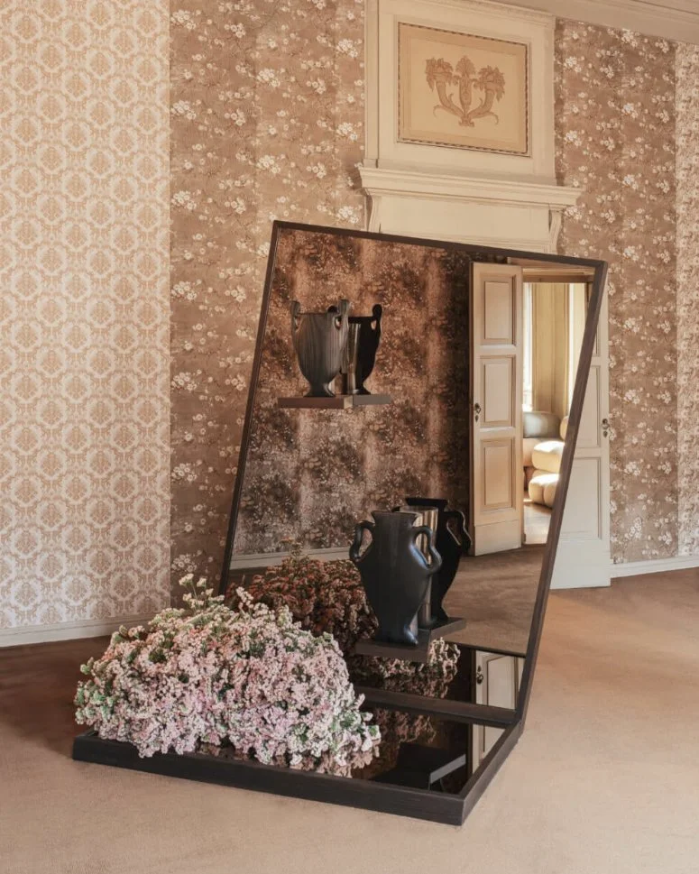
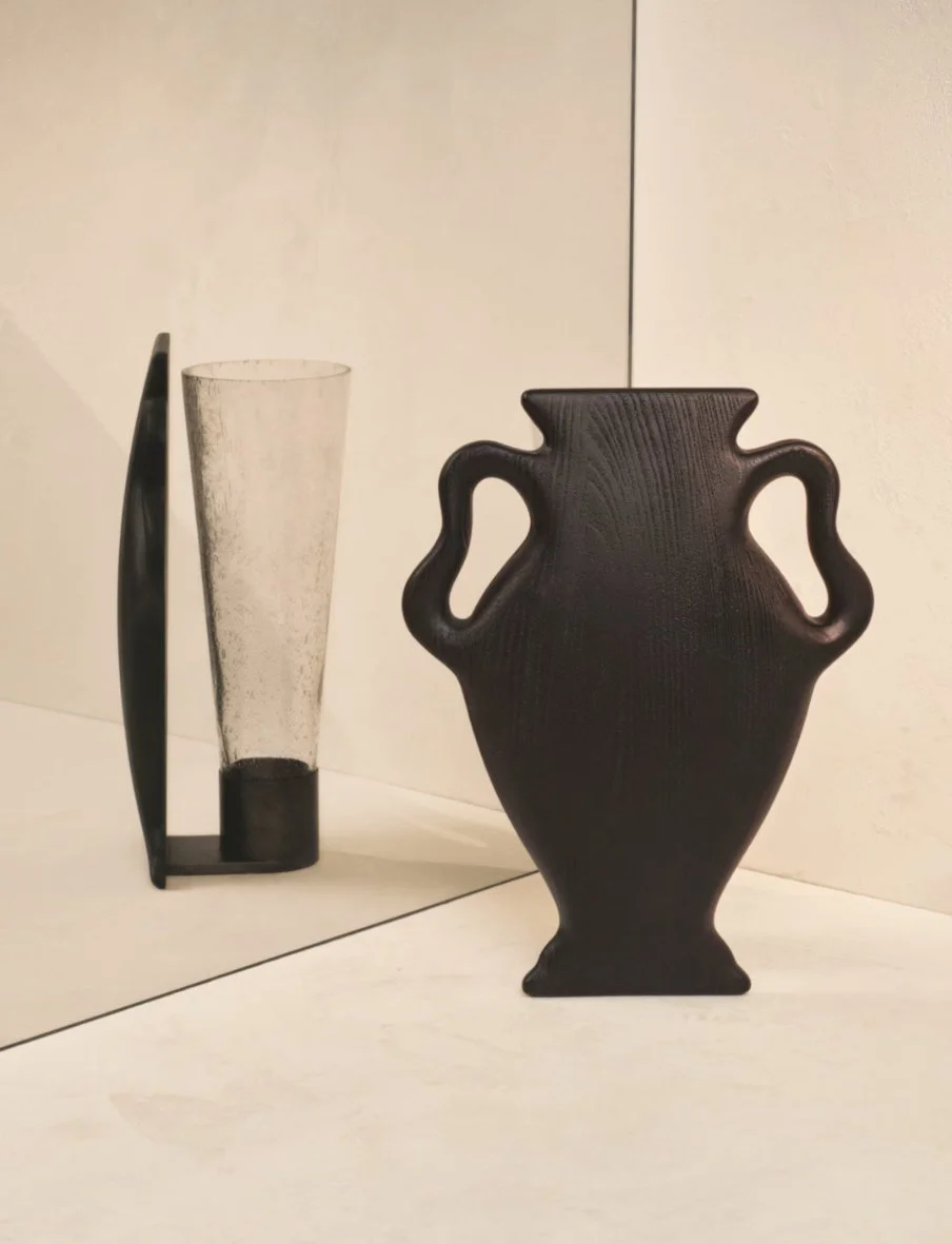
The Floral Room (The Illusion of Space):
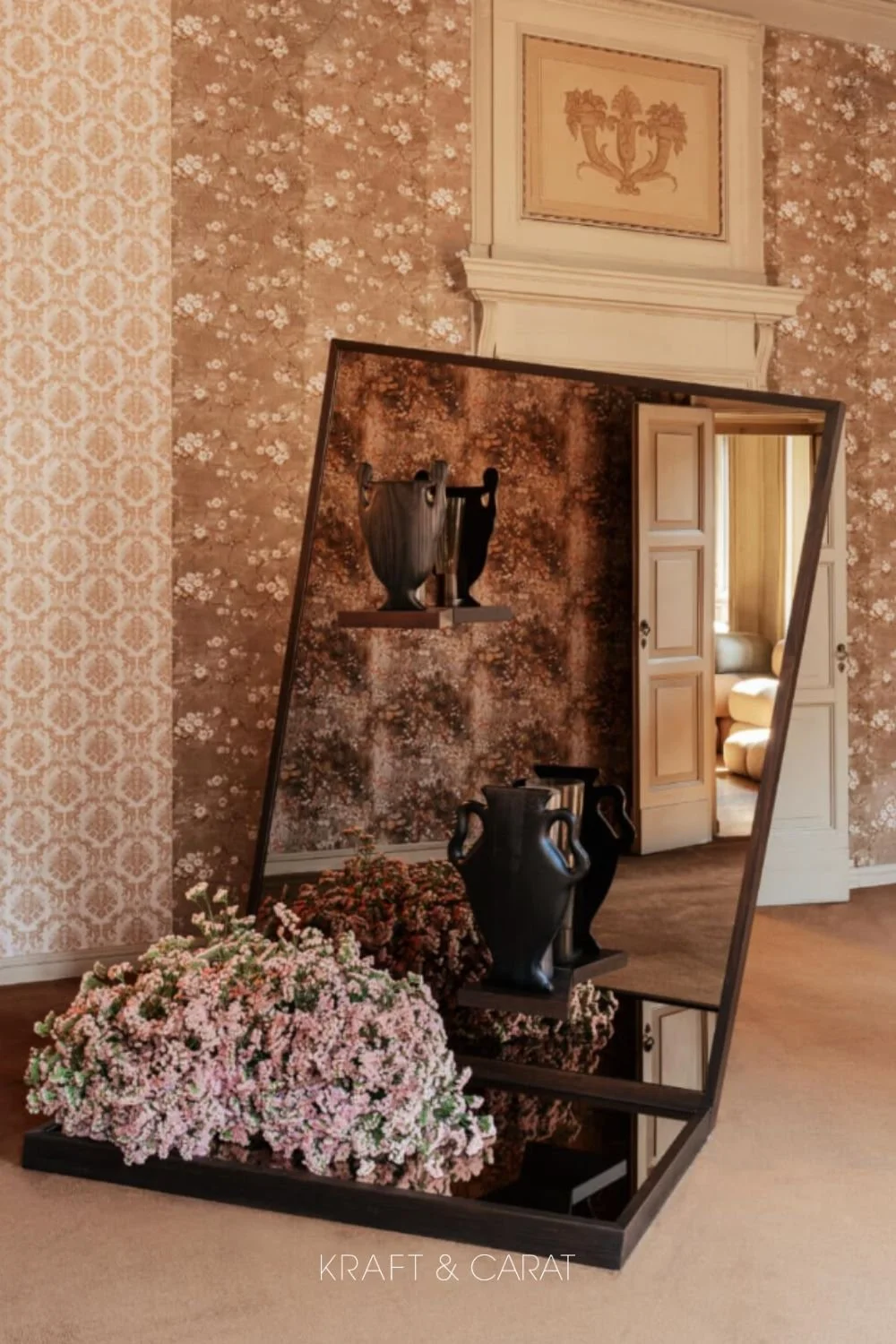
Here, the designers played with perception. The new Curva vase was displayed against expansive mirrors. The reflection blurred the lines between the real floral arrangements in the room and the lush floral wallpaper behind them, creating a mesmerizing infinity effect. The vase itself is a brilliant trompe-l'œil that challenges visual perception.
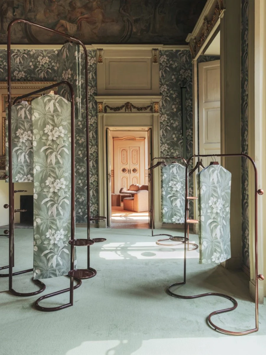
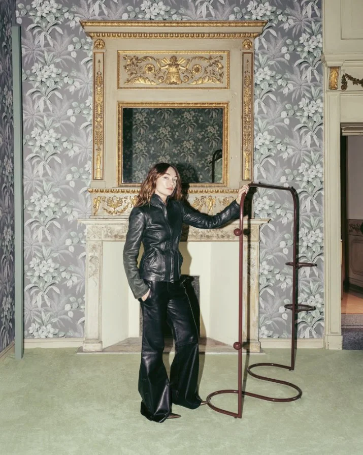
The Dressing Room (The Power of Contrast):
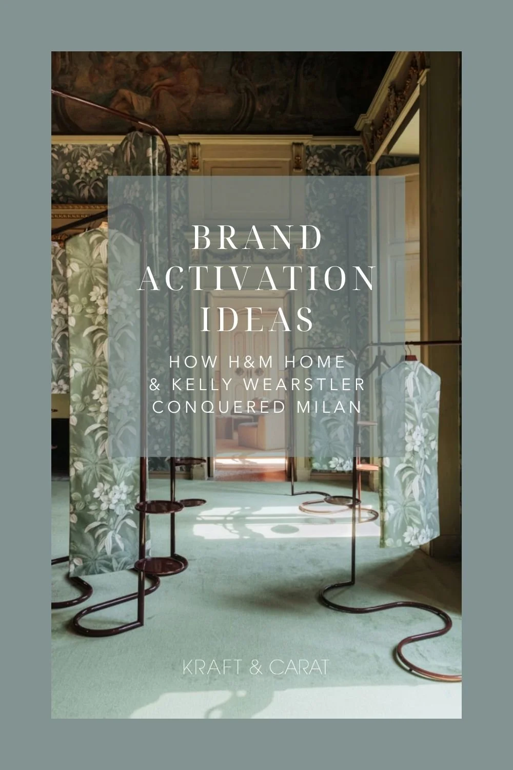
This room featured the undulating, wavy Mona clothing racks lacquered in a deep, rich burgundy (bordeaux). Standing against classic "verdure" tapestry-style wallpaper and matching garment bags, the modern, glossy metal cut through the traditional heritage patterns flawlessly.
To complete the immersive experience, Wearstler engaged the senses beyond the visual. A bespoke home fragrance, created with her Californian gallery Side Hustle, filled the palazzo with notes of orange blossom, jasmine, and palo santo. It was California cool meeting Milanese grandeur.
How to Get the Kelly Wearstler Style at Home
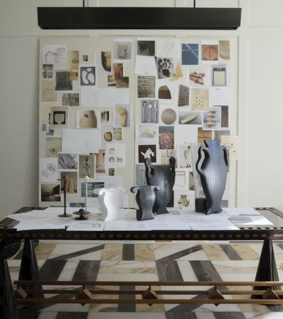
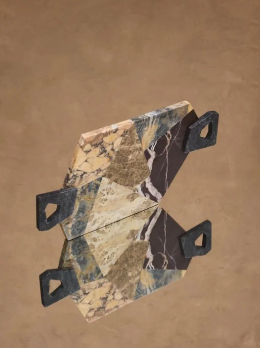
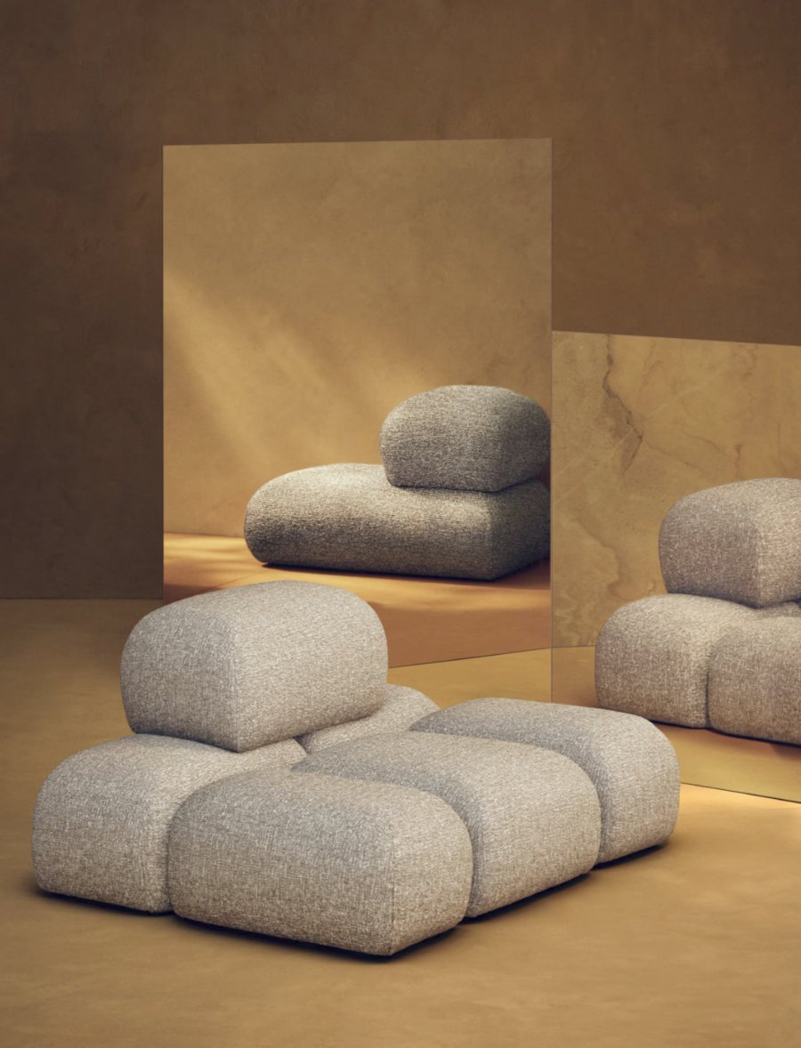
While we have to wait until September to get our hands on the collection, the Milan preview gave us a glimpse of the brilliance to come. From a stunning stone marquetry tray, evoking palazzo marble floor or even revisited ancient craftmanship “pietra dura”, to a fully modular sofa system, the collection plays heavily on scale, illusion and adaptability.
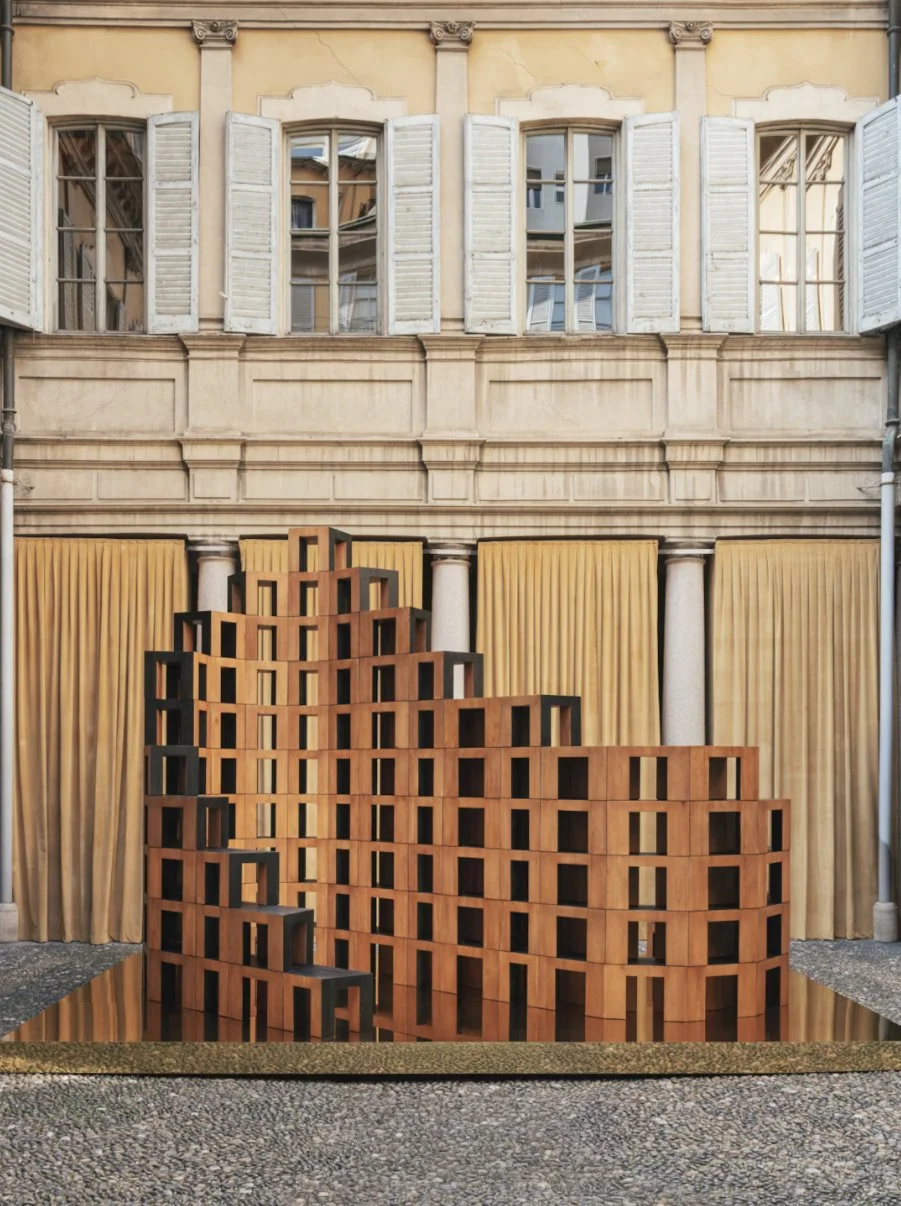
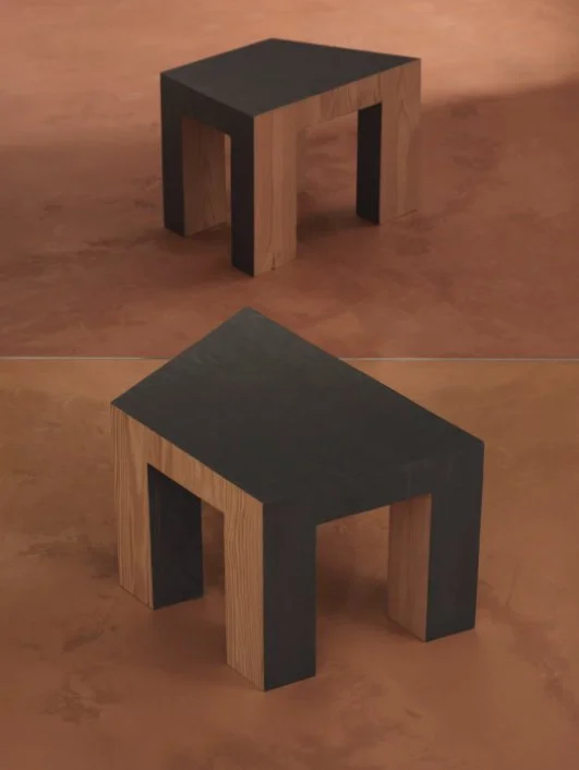
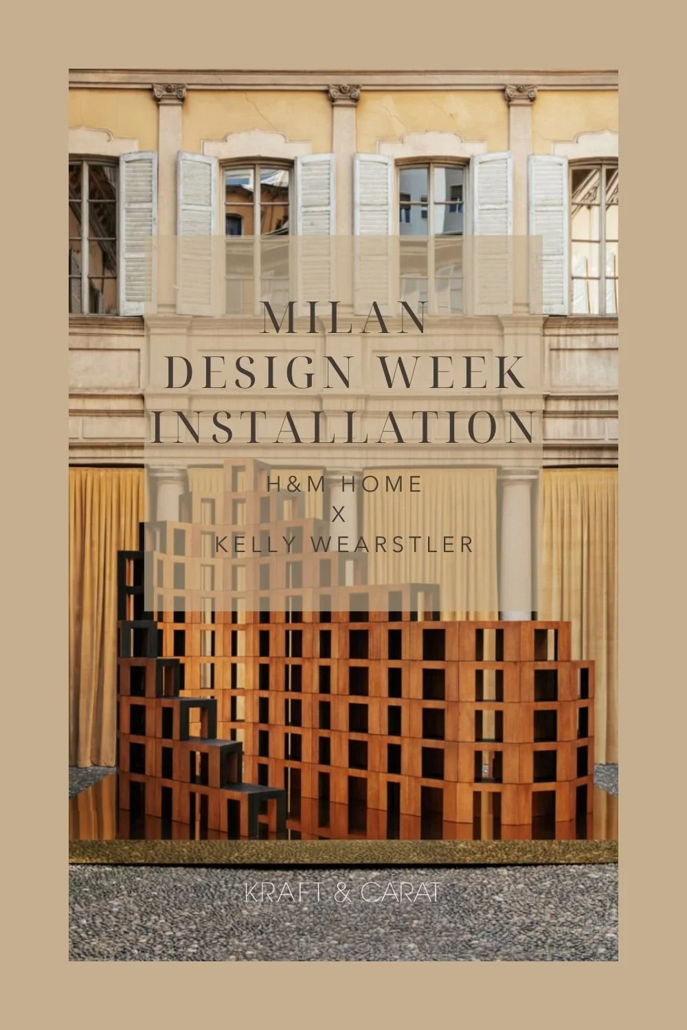
Standouts include the Ortra coffee table—designed for infinite modularity—and brutalist-inspired stools that were accumulated to look like a sculptural installation (as beautiful as they are well designed down to the smallest detail, notably to optimize storage and transport)
The Curator's Takeaway
This collaboration is proof that great design isn't just about the price tag; it is about the intention behind the shape. Wearstler and H&M Home have successfully distilled the essence of luxury boutique hospitality into pieces we can bring into our own living rooms.
The countdown to September the 3d begins now.
Can't Wait Until September?
If you want to bring Wearstler’s iconic aesthetic into your home right now, studying her coffee table books is the best place to start.
Her monograph, Evocative Style, is a staple in our studio library and an absolute must-read for mastering bold, architectural interiors.
☞ Looking for more design book recommendations? Check out my ultimate Curator's Library Edit here.
photo credit: Piergiorgio Sorgetti for H&M , except moodboard picture by Gemma Warren
For the Design Professionals
Want to present your own design concepts with the same level of editorial storytelling as a Milan exhibition? Elevate your client pitches with my Interior Design Templates . Build agency-level moodboards and presentations in Canva in minutes!
Hover over your favorite image above to pin it...