
CASE STUDY: MASTERING THE WINDOW DISPLAY SCHEME (Lessons from Hermès)
If your boutique features multiple storefront windows, you’ve likely faced this common visual merchandising dilemma: How do you design distinct displays for different products without making your facade look like a chaotic garage sale?
In the retail design industry, the answer is what we call a "Scheme". In French, we beautifully refer to this as the “Fil Rouge” (literally, the "red thread" or guiding principle). A strong scheme is a singular creative concept that seamlessly ties multiple windows together, creating a unified brand narrative while allowing each product to shine individually.
To understand how to master the art of the Scheme without being repetitive, let’s look at a masterclass in storefront design from one of the most iconic luxury houses: Hermès.
THE HERMES “RED THREAD” CONCEPT
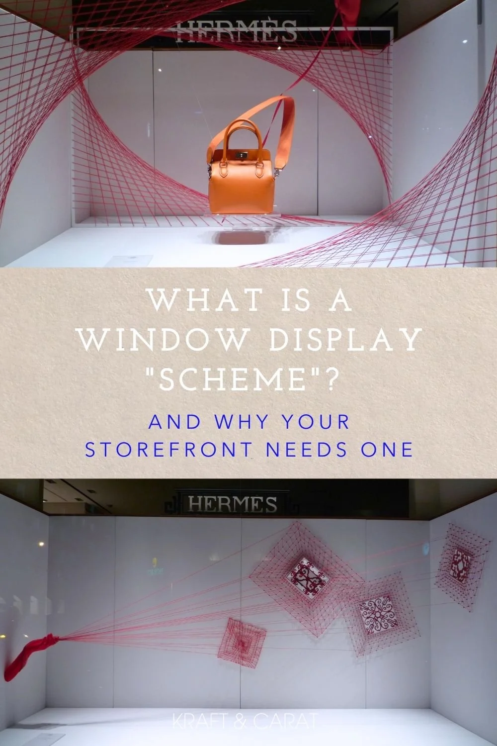
A few years ago, on Avenue George V in Paris, Hermès quite literally brought the Fil Rouge to life.
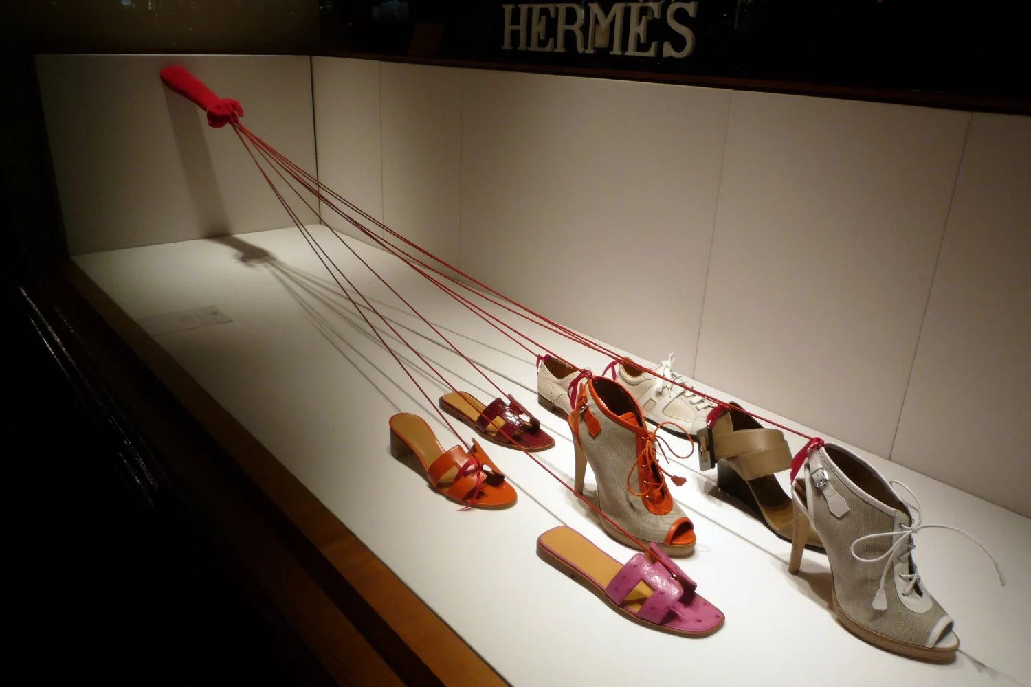
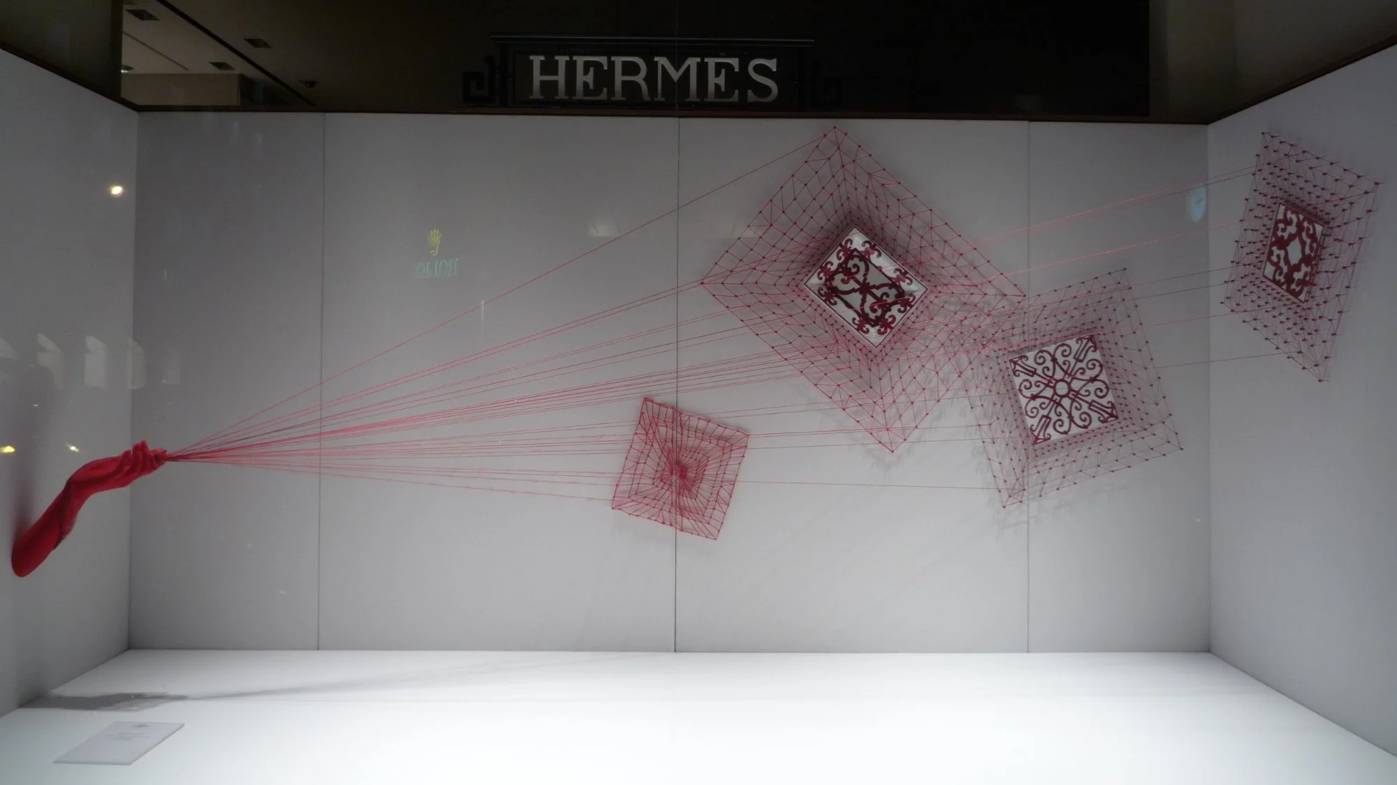
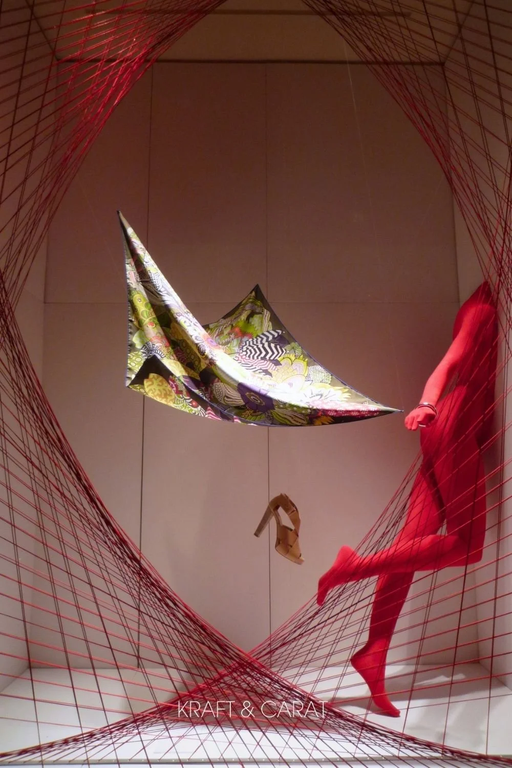
The concept was brilliant in its simplicity: Hermès played the puppeteer. Across their multiple storefront windows, the visual merchandising team used a single, unifying motif—elegant red hands manipulating vibrant red strings—to create an aerial, spiderweb-like presentation.
One cannot look at this tensioned web of red yarn without thinking of the mesmerizing, large-scale installations of Japanese contemporary artist Chiharu Shiota. By channeling this high-art reference, Hermès elevated a simple retail display into a museum-worthy exhibition.
Instead of repeating the exact same layout in every window, they adapted the behavior of the red strings to highlight the specific typology of the product being displayed.

radical inspiration from Chiharu Shiota
whimsical declination
DECONSTRUCTING THE VISUAL MERCHANDISING STRATEGY
High-Contrast Color Theory
By placing vibrant, monochromatic red hands and strings against a stark, clinical white backdrop, Hermès created maximum visual impact. The high contrast naturally caught the eyes of passersby from across the street, while the minimal background ensured the luxury products remained the undeniable heroes of the space.
Adapting the Scheme to the Product
The genius of this display lay in its variations. The red string was the "Scheme", but its application was entirely customized to tell a specific story for each product:
The Shoes: Held on a literal "leash" by the puppeteer's hand, adding a surreal, humorous twist to a daily walk.
The Handbag: Suspended mid-air, trapped in a highly artistic, geometric web of tensioned red strings.
The Porcelain Plates: Mounted vertically on the wall, framed by a radiating rosette of strings that playfully mimics the mechanics of giant yo-yos.
The Hats: Levitating effortlessly, with the red hands acting as literal puppeteers holding the strings from above.
The Book: Centered between hands playing a nostalgic game of "Cat’s Cradle" (the classic string game), wrapping the product in a storytelling narrative.
The Porcelain Trays : Soaring like delicate kites, tethered by the red string and floating in the breeze
The Duality of Tone (Art Meets Whimsy)
Perhaps the most powerful lesson here is the duality of the narrative. On one hand, the installation feels highly artistic and poetic (channeling the mesmerizing contemporary art of Chiharu Shiota). On the other hand, it is profoundly playful—featuring yo-yos, kites, and walking shoes on a leash.
There is a common misconception that luxury must be stiff, serious, and untouchable. Hermès proves the exact opposite. A touch of “décalage” (quirkiness and humor) makes the brand feel confident, approachable, and deeply human. You don't have to take yourself too seriously to command a premium price tag.


HOW TO APPLY THE “SCHEME” CONCEPT TO YOUR BOUTIQUE
You don't need a Parisian luxury budget to execute a cohesive scheme. Whether you are using raw kraft paper, wooden blocks, simple ribbons, or… a red thread, the "Kraft & Carat" methodology remains the same:
Choose One Core Element
Pick one strong prop, one distinct color, or one specific material. This is your anchor.
Vary the Execution
Do not copy-paste the exact same display in every window. Let your chosen element interact differently with a shoe than it does with a piece of jewelry.
Maintain the Thread
As long as the material or color remains consistent across the facade, the pedestrian's brain will seamlessly connect the dots, registering your storefront as one high-end, cohesive brand experience.
READY TO ELEVATE YOUR STOREFRONT?
Mastering your visual scheme is just one piece of the puzzle. Creating a magnetic window display requires strong foundations in lighting, scale, and spatial composition.
Want to know if your storefront meets luxury standards and is optimized to attract foot traffic?
Pin for inspiration, or share these retail strategies with your network.