
Eccentric Architecture & Visual Merchandising inside the New Hermès "Maison" in London
I recently had the privilege of visiting the newly expanded Hermès flagship on New Bond Street during its opening week. After years of meticulous renovation orchestrated by the Parisian architecture agency RDAI, in collaboration with local stakeholders, this spectacular 2,000-square-meter retail sanctuary has been elevated to the rank of a "Maison"—a prestigious title Hermès reserves for only its six most iconic global destinations.
From its labyrinthine layout to the surprising eccentricity of its storefront windows, here is a masterclass in experiential retail design, and the takeaways you can apply to your own commercial spaces.
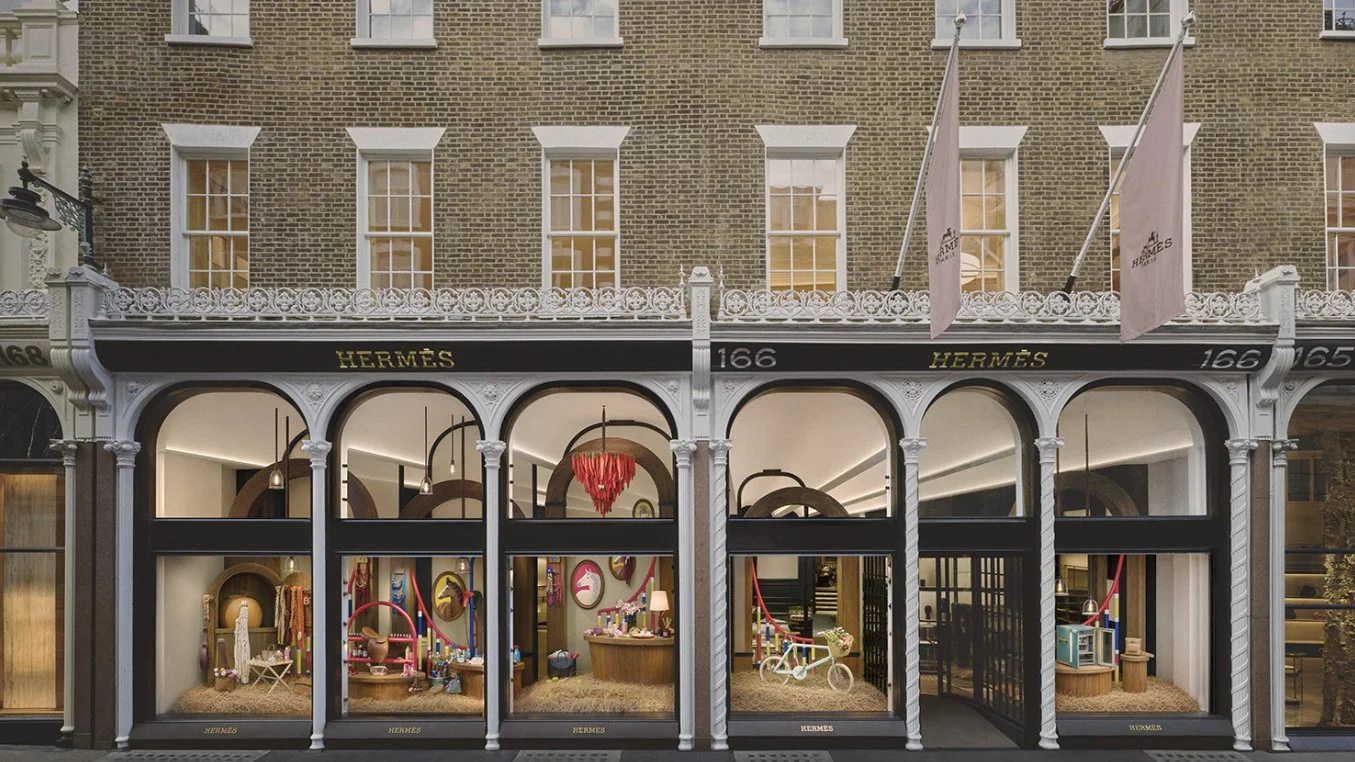
AN ECCENTRIC “WONDERLAND”, ARCHITECTURE
The architectural brilliance of this flagship lies in its complexity. The space is actually the result of merging six different historical buildings, each from a different era, with varying styles and floor heights.
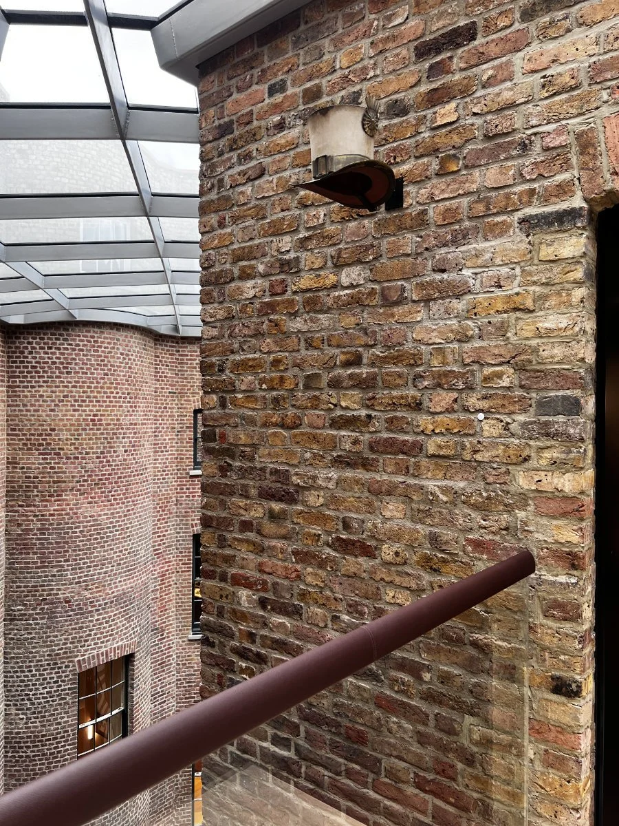
Instead of erasing these differences, RDAI embraced them. Navigating the space means crossing suspended walkways that bridge the different buildings together. Floating without solid walls above the central courtyard, these open footbridges make you feel like you are wandering through a luxurious, eccentric labyrinth—giving the space an almost "Alice in Wonderland" quality.
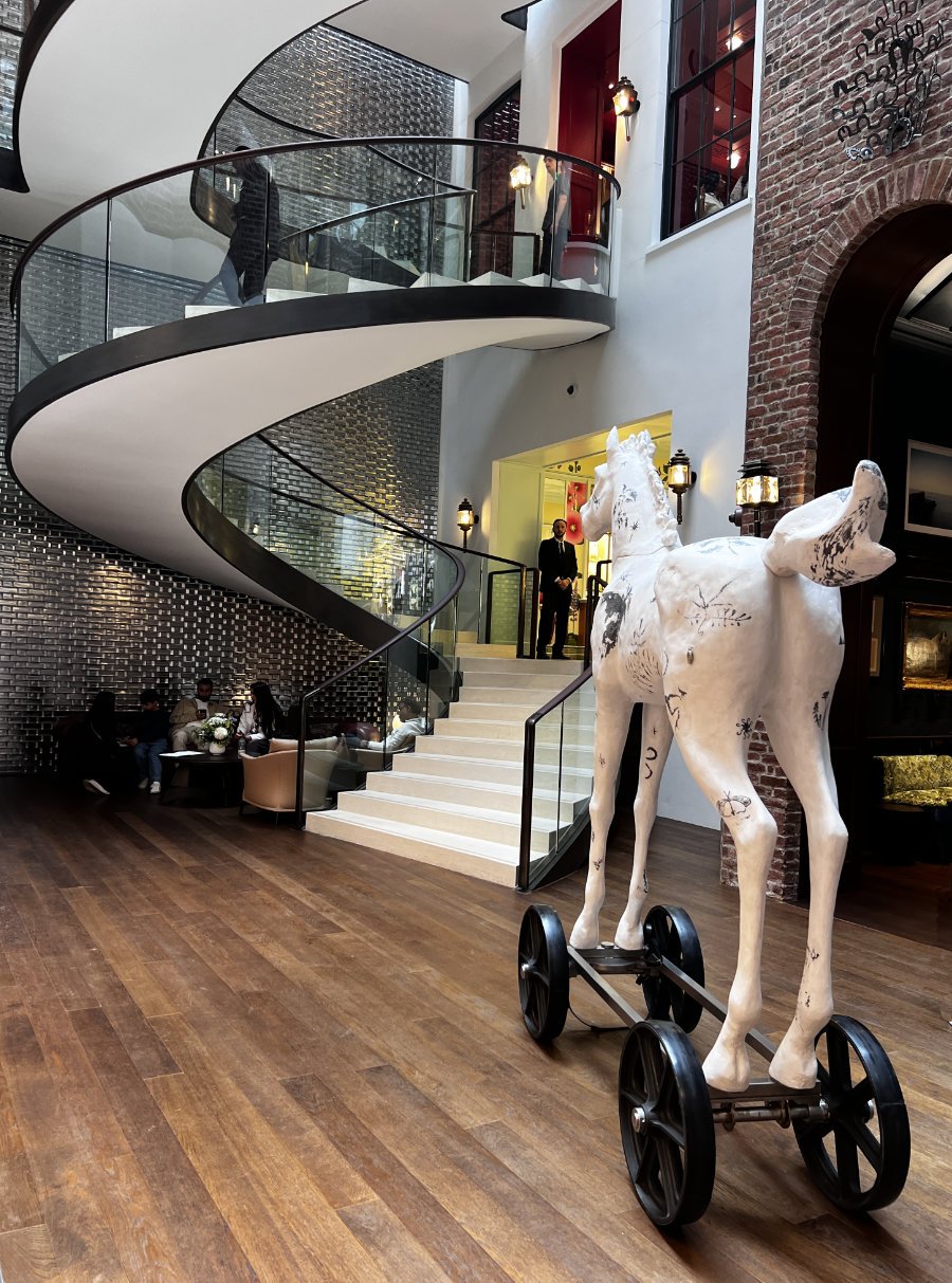
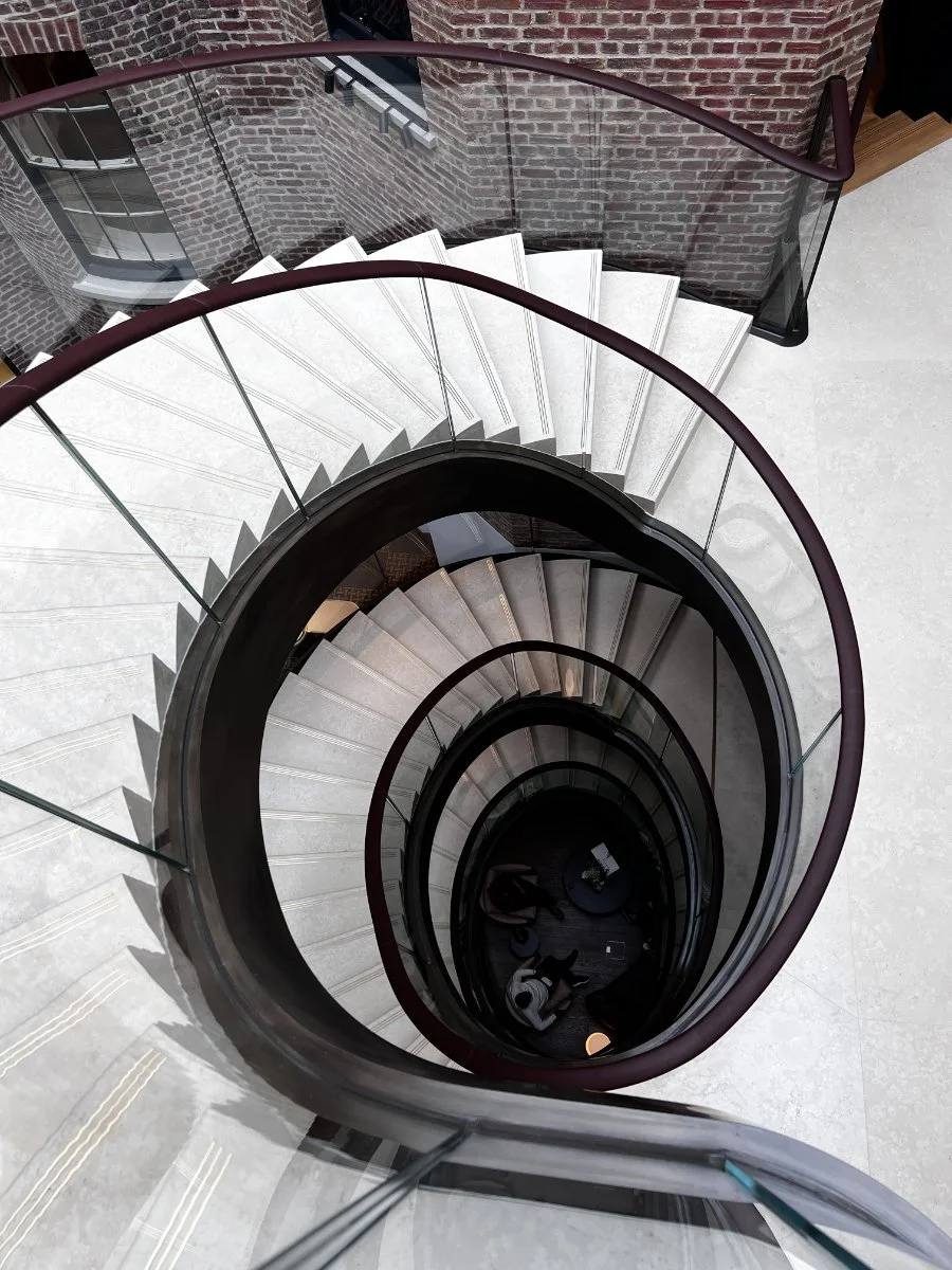
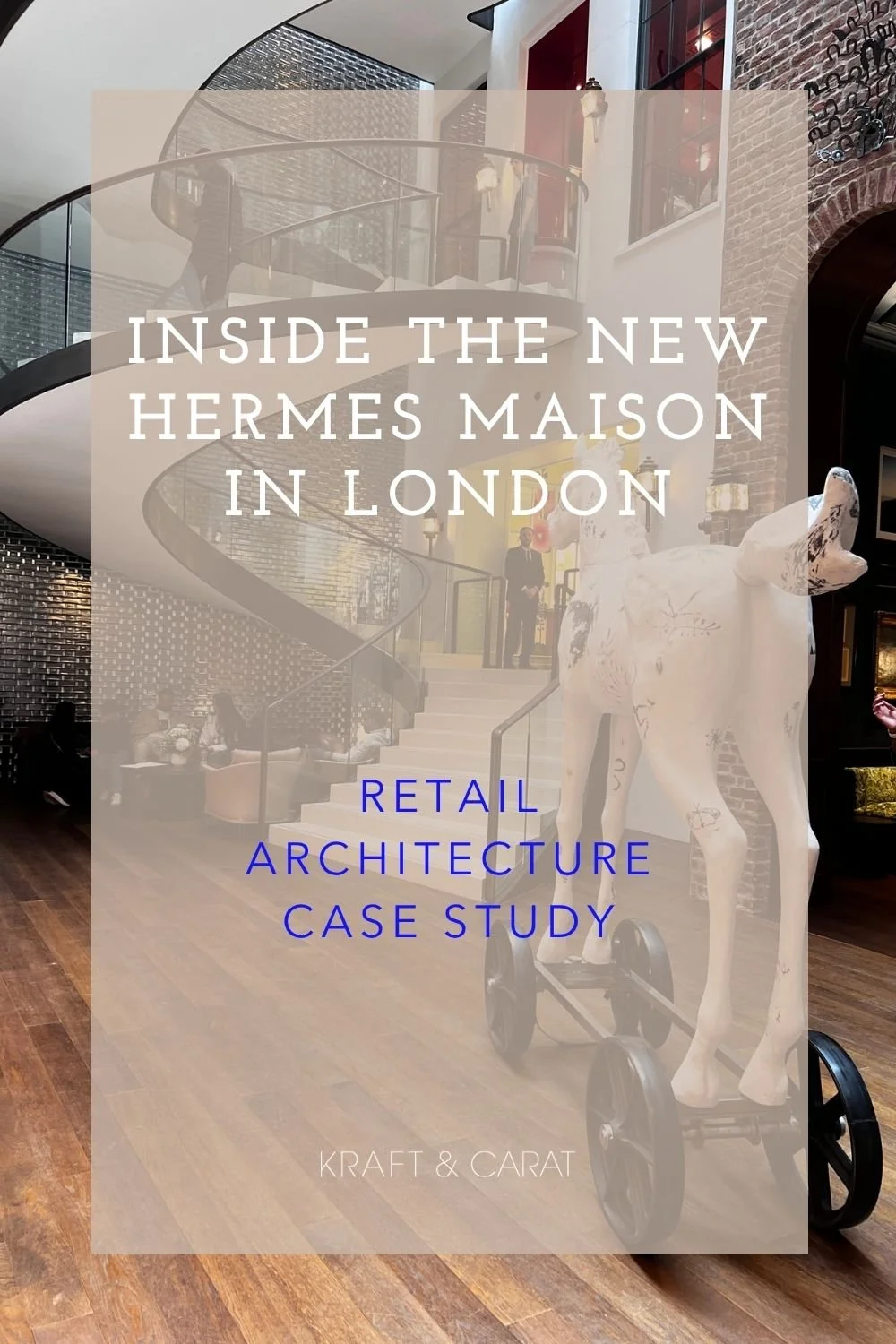
At the center of a former open courtyard sits a majestic, sweeping staircase with a soft leather handrail. It is framed against a striking backdrop: a monumental wall of mirrored glass bricks, a subtle nod to the industrial heritage of Manchester. As you wander, the old facades are punctuated by unexpected historical details. Antique carriage lanterns (a nod to the brand's equestrian roots) and vintage boutique signs surprise the visitor—like an old hatter’s sign that perfectly complements that Mad Hatter, wonderland vibe.
55 ROOMS, AS MANY MICRO-UNIVERSES
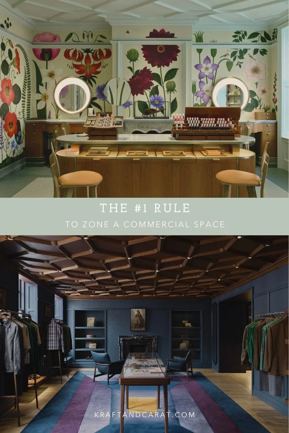
The Maison is divided into 55 distinct rooms and VIP lounges. Each space is color-coded to evoke a specific métier (craft or department), possessing its own unique identity while strictly preserving historical elements like original fireplaces and molded ceilings.
The lighting and color strategies shift dramatically from one room to the next. Some are dark and moody, while others are luminous, utilizing full floor-to-ceiling "color drenching" techniques:
The Equestrian Universe: The walls are paneled in exquisite straw and horsehair marquetry, a testament to raw, honest materials elevated by craftsmanship.
The Men's Universe: A coffered wood ceiling grounds the space, while the floor is covered in a carpet so plush it feels like walking on a cloud.
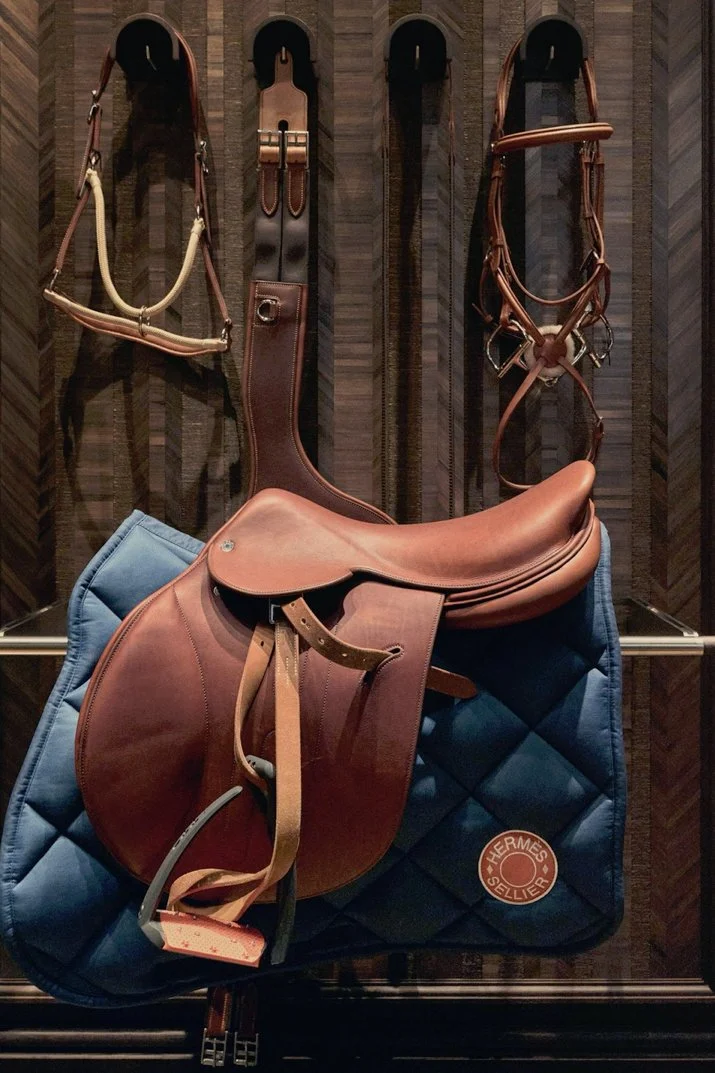
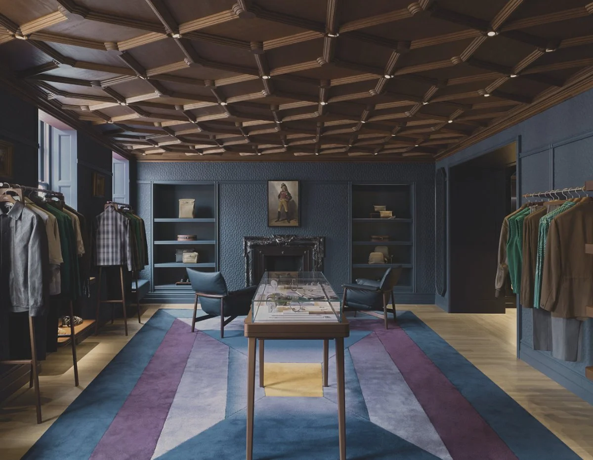
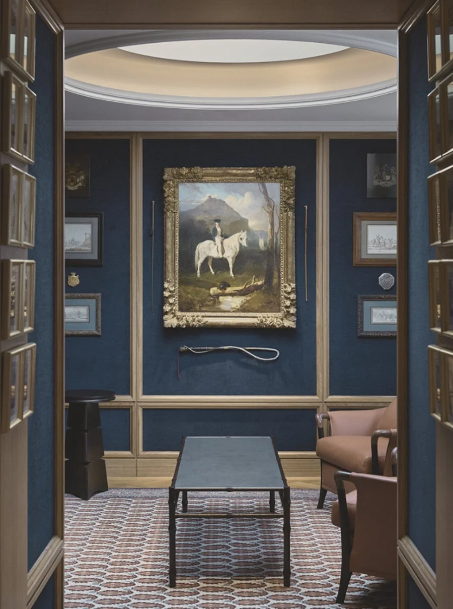
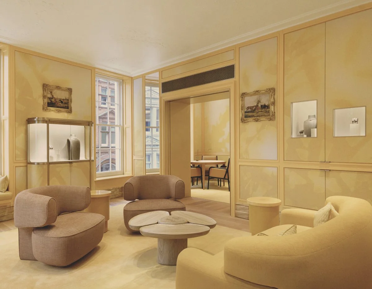
The Jewelry Universe: Wrapped in a bespoke yellow cloth wallcovering, the room gives the illusion of warm sunlight streaming through trees.
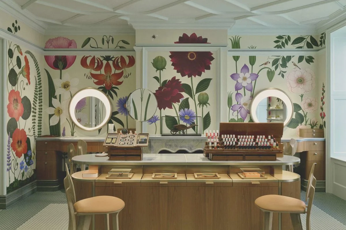
The Beauty & Perfume Universe: Thought as an "Imaginary Orangerie," the space is brought to life by delicate, immersive floral frescoes hand-drawn by London illustrator Katie Scott.
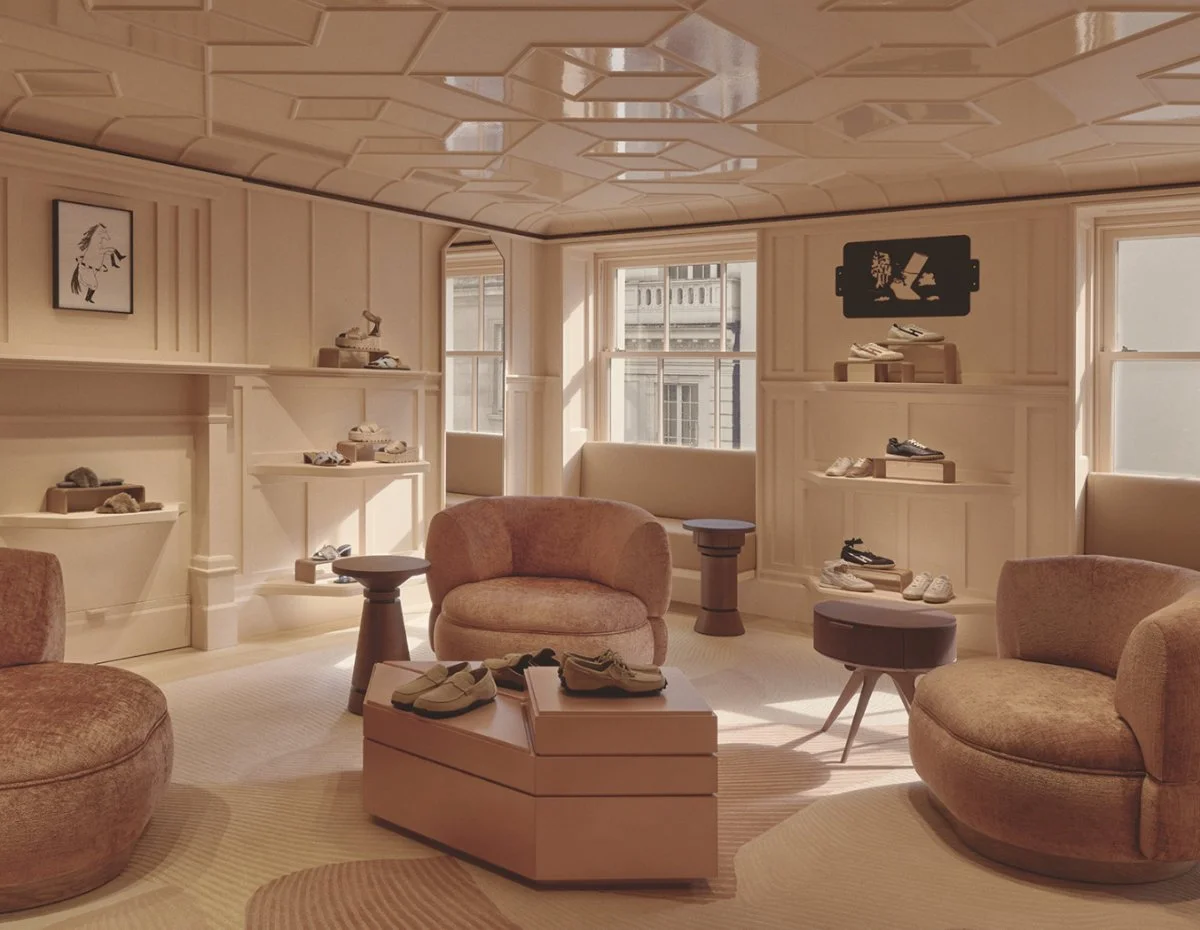
The Shoes Universe: A soft pink, color-drenched sanctuary, perfectly counterbalanced by a clever play of moldings and the contrast between matte and brilliant textures.
The Ultimate Luxury Detail: The dedication to the color palette is so absolute that even the soap provided in the restrooms perfectly matches the red color scheme of the space.
ART IS EVERYWHERE (The Eclectic Family Home)
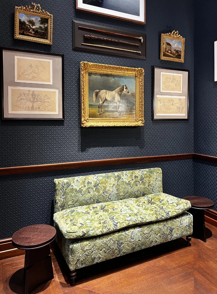
With around 500 artworks scattered throughout the Maison, the space could easily feel like a sterile museum. Yet, it feels like the home of an eclectic, highly cultured family.
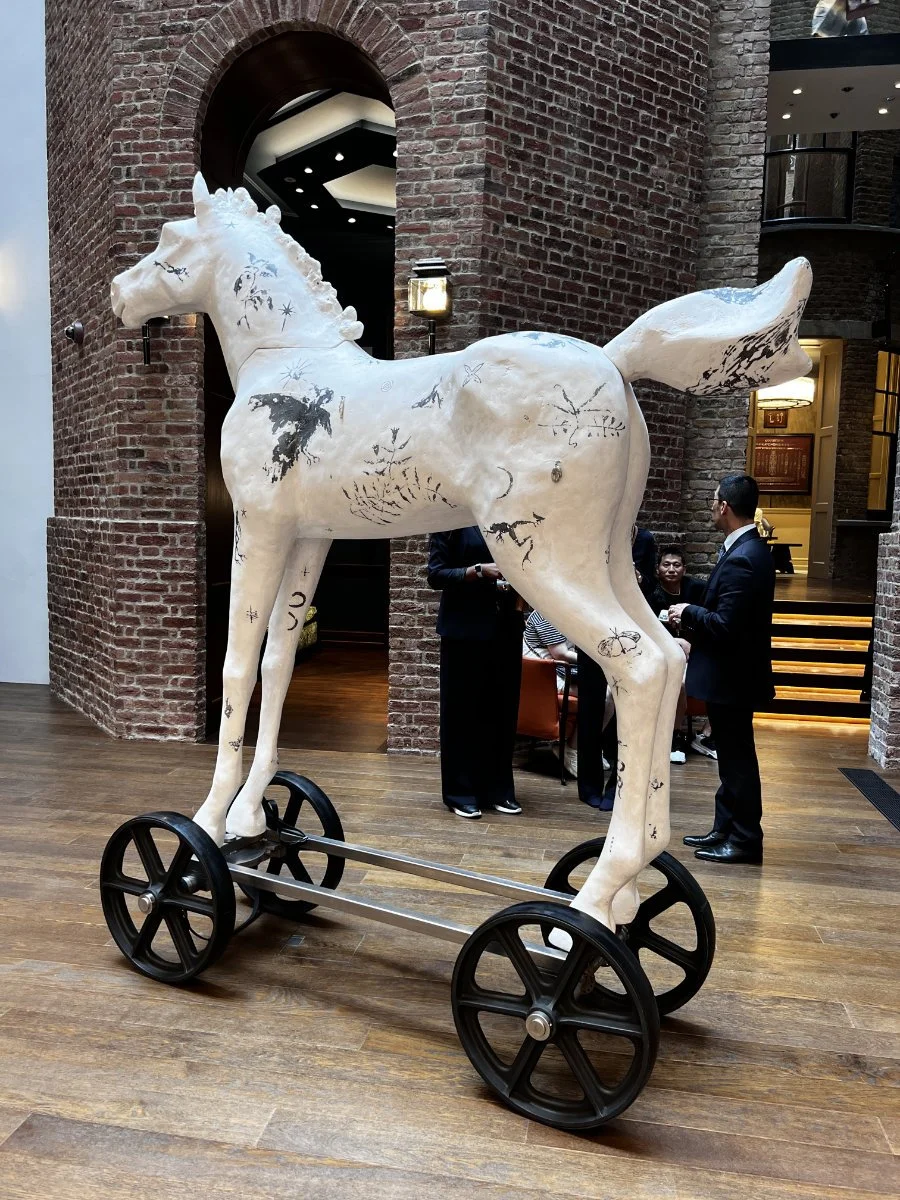
The curation spans centuries and styles. At the foot of the main staircase stands a striking, oversized equine sculpture by British artist Jessica Wetherly, immediately anchoring the brand in contemporary art. As you explore the rooms, classical pieces effortlessly share the space with bold, modern photographs by Martin Parr or funny drawings...
THE STOREFRONT: VISUAL DISRUPTION & THE ART OF THE PROPS
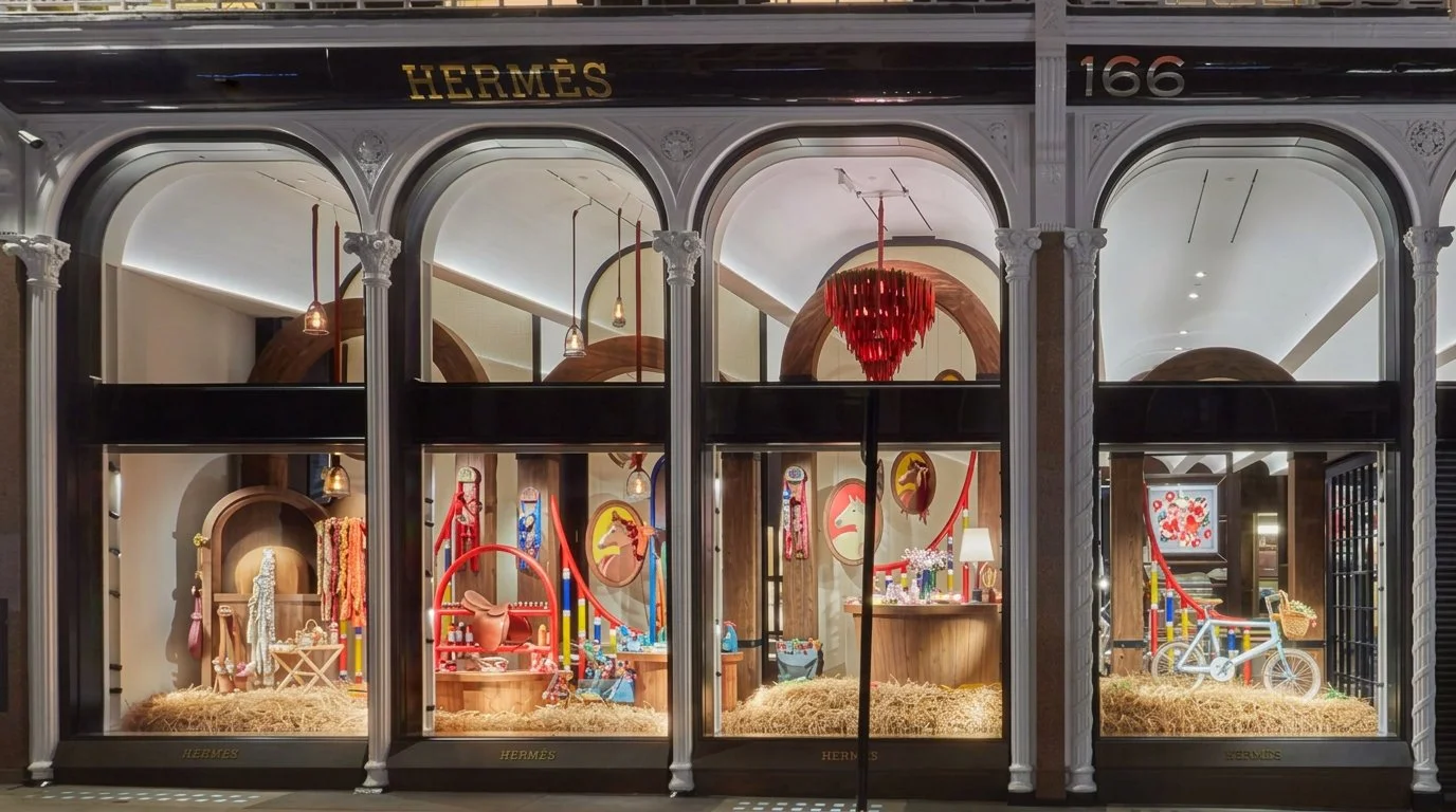
While the interior breathes seriousness, heritage, and "Quiet Luxury", a brilliant breath of fresh air blows through the storefront windows.
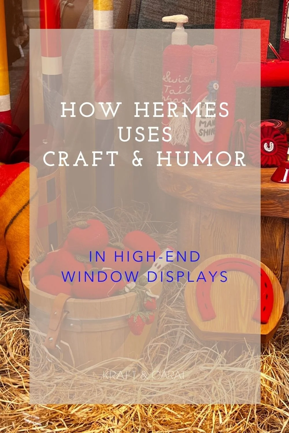
Hermès unveiled "Rocabarn", a conceptual beauty salon for horses, conceived by English artist Kate Jenkins and her "army" of knitters. It is a burst of playful humor designed to entertain clients waiting in line outside.
What makes these windows truly exceptional is the intentional use of materials and the flawless interconnection between the products and the props:
The Material Contrast: Inside the boutique, straw is treated as the ultimate luxury material (straw marquetry). Outside in the window display, it is presented in its rawest form: as literal horse bedding scattered on the floor.
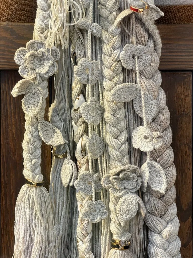
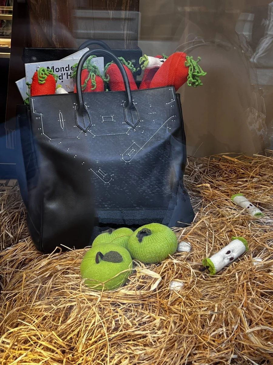
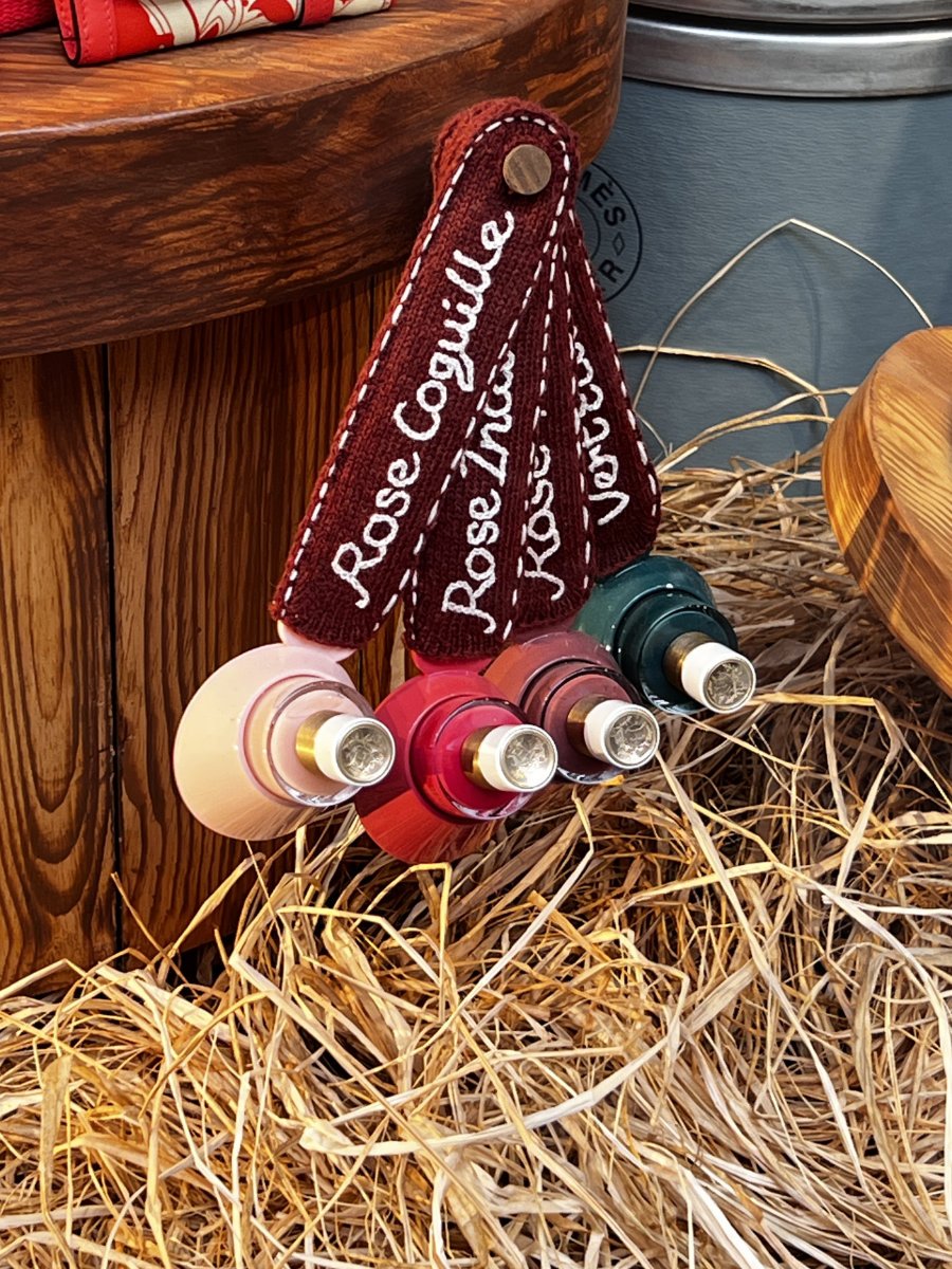
Product-Prop Integration: The luxury goods aren't just sitting next to the props; they are deeply intertwined. A horse’s tail is intricately braided with real Hermès rings and a silk scarf. A luxurious Kelly bag is casually filled with crocheted carrots and apple cores. Even the hoof-shaped nail polish bottles feature their color names beautifully embroidered and attached to them. The devil is truly in the details.
WHAT INDEPENDANT BRANDS CAN LEARN FROM THIS
You don't need 2,000 square meters to apply this genius to your own boutique. Here are the takeaways:
Zone Your Space
Even in a small shop, create "micro-universes." Use a different rug texture, a contrasting wall color, or a shift in lighting to transition the customer from your apparel section to your accessories.
Make Props Interact
Don't just place a shoe next to a vase. Make them interact. Fill a luxury bag with unexpected objects. Braid your jewelry into the display. When products and props tell a shared story, the display becomes magnetic.
Contrast Your Tone
Your interior can be highly sophisticated, but your storefront is allowed to have fun. Using humor and raw materials creates visual disruption.
✎ Image courtesy of Hermès for Facade & Rooms (photo Valérie Sadoun) ; stairs, art & window display pictures by Kraft & Carat
READY TO ELEVATE YOUR STOREFRONT?
Before you commission a crocheted horse, a magnetic window display requires strong spatial foundations.
Even the most creative ideas will fall flat if the lighting and composition are wrong.
Pin for inspiration, or share these retail strategies with your network.